
Black Friday 2026 is Friday 27 November, with Thanksgiving on the 26th and Cyber Monday on the 30th. Sixteen days earlier, on Wednesday 11 November, is 11.11 — larger than Black Friday across Vietnam and much of South-East Asia, and for a lot of shops the real opening of the season rather than a separate event.
Treat it as one trading fortnight with two peaks. Nine templates in the library cover it. They all carry a countdown and an order form, so the design is not what separates them — what separates them is how much photography each one demands, and how loud it is willing to be.
Read the photograph count first
Every template page states the exact number of photographs the layout expects before you start. For this season the range is wide: ten at one end, thirty-seven at the other. That number, not the look, is what decides whether the page ships.
A page built on a template that wants thirty-seven images and has eleven does not look minimal. It looks unfinished, because the layout keeps opening spaces the content cannot fill. Choose for the material you actually have.
The seven Black Friday pages, lightest first
Black Friday Last Chance — ten photographs
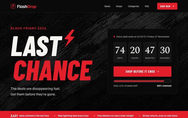
Twelve sections and only ten images, dark and serif. The one to reach for when you are short of photography and long on urgency — a final-hours page, a closing offer, a weekend that ends tonight. The dark ground does a lot of the work that images would otherwise have to.
Black Friday Home Sale — the shortest page

Eight sections, sixteen photographs, light and bold. The shortest page of the set, which makes it the fastest to fill and the easiest to read on a phone — where most Black Friday traffic arrives. If you are unsure, this is the safe choice.
Black Friday Drop Board — discounting without looking cheap

Eleven sections, fifteen photographs, and tagged editorial and luxury as well as light and serif — the least shouty page here. For brands whose customers would be put off by a countdown in forty-point type, but who still want the date to do its work.
Black Friday Early Access — built for a list
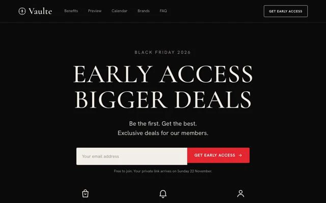
Twelve sections, sixteen photographs, dark and serif. The structure assumes two audiences: people already on your list who get in first, and everyone else who gets in later. If you have an email list worth rewarding, this page is shaped around that mechanic and the others are not.
Black Friday Premium Brands — when the names are the offer

Twelve sections, nineteen photographs, light, serif and luxury. Built for multi-brand retail, where what persuades is the list of labels rather than the depth of the discount. Expect to need clean brand imagery, not just product shots.
Black Friday Mega Sale — the department store

Twelve sections, thirty-one photographs. The full treatment: categories, tiers, multiple routes in. It is the right page for a wide catalogue and the wrong one for a shop with a dozen products, which will rattle around inside it.
Black Friday Marketplace — thirty-seven photographs
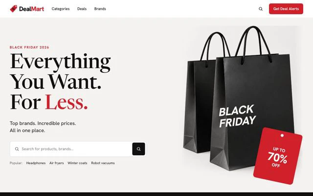
The largest in the library for this season. Only start it if the images already exist — if you are commissioning photography in the second week of November, choose Home Sale and spend the time on the offer instead.
11.11, and the sales that are not pinned to a date
11.11 Flash Sale

Light, twelve sections, twenty-eight photographs, countdown and order form. Written for the Singles' Day mechanic — a hard start, a hard end, and a page that assumes the visitor already knows the date matters.
Kids 11.11 Sale

The playful version at twenty photographs, for toys, children's clothing and family goods. Warmer in voice, and the layout expects a range rather than a hero product.
When the date is yours, not the calendar's

Dated Flash Sale is deliberately generic — ten sections, ten photographs, bold — for a sale that is not tied to anybody else's day. It is the page to keep and reuse.
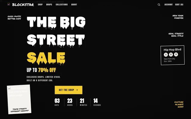
Waitlist Drop collects demand before a release instead of selling into it. Eight sections, fifteen photographs. Useful in the fortnight before Black Friday if what you are launching is not ready to buy yet.
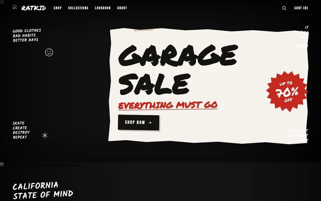
Streetwear Clearance Sale carries no countdown, which is correct: a clearance has no deadline to fake. Nine sections, twelve photographs, bold and playful. The page for the week after, when the stock that did not move has to.
The countdown has to be true
Every page above can show a live countdown, and on a Black Friday page it is the one element visitors will check. Three rules, learned the expensive way:
- Set it to the time the offer actually ends, not to a round number that looks better.
- Decide in advance what the page says when it hits zero. A clock that expires with the discount still live teaches every returning visitor that your deadlines are decoration.
- Do not restart it. A countdown that resets at midnight is the single fastest way to lose a returning customer's trust, and people do notice.
The Countdown shelf lists every template in the library that carries one, seasonal or not.
Working back from 27 November
- Now: pick the template by photograph count and start gathering images. This is the step that slips.
- By 5 November: page live, so 11.11 has somewhere to point and the page has been indexed before the traffic arrives.
- 24 November: last sensible day to change anything. Whatever is broken on the 24th will be broken at the busiest hour of your year.
- 27–30 November: the peak. Watch the form, not the design.
- 1 December: the page becomes something else — a clearance, a Christmas page, or an honest notice that the sale has ended.
Starting from any template costs no credits, and the AI will fit the copy to your business for about 20 credits if you would rather not write it, keeping the layout as drawn.
What comes next
Before this: Halloween, four weeks earlier and a different job entirely. After it: Christmas, where the deadline is your last posting day, and New Year, which outlives all of them. The five dates and their lead times are in the 2026 seasonal calendar, and the rest of the shop templates are in the ecommerce collection.