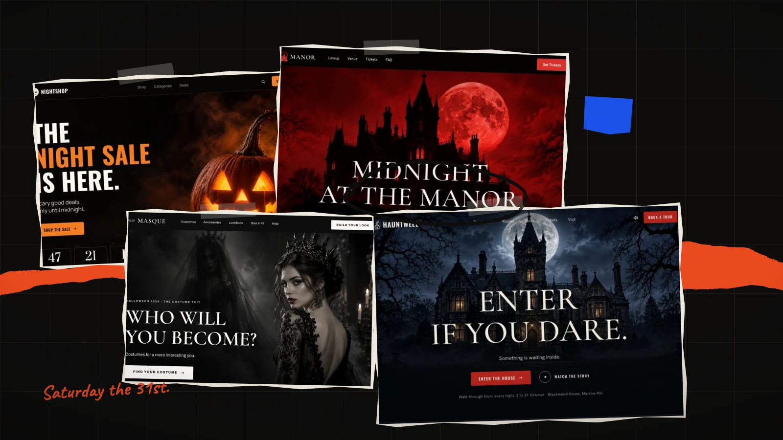
Halloween 2026 falls on Saturday 31 October. That single fact changes what sells. A weekend Halloween moves money towards ticketed nights, venue hire and parties, and it pulls costume and confectionery buying forward by several days, because people are planning an evening rather than reacting to one.
It also splits the work cleanly. Either the page takes an order, or it fills a room. Those are different pages with different forms, and choosing the wrong one costs you the enquiry you would otherwise have won. Seven templates in the library cover both.
First, decide which job the page has
Before looking at any design, answer one question: can someone complete the transaction on the page? If they can — a costume, a box of sweets, a discounted basket — you want an order form. If they cannot, because the thing is a group booking, a private hire, a table for twelve or a walk-through slot that needs confirming, you want an enquiry form.
Putting an order form on a page that cannot actually take the order is the most common way a seasonal page underperforms. The visitor reaches a checkout that does not apply to them, and leaves without telling you they were interested. The reverse is almost as bad: an enquiry form on a page selling a £12 item adds a step nobody needed.
Every template below states which form it carries on its own page, along with its section count and the number of photographs it expects. That photograph number is the one to read first — it is what decides whether you can ship this week.
Pages that sell something
Halloween Night Sale — the biggest of them
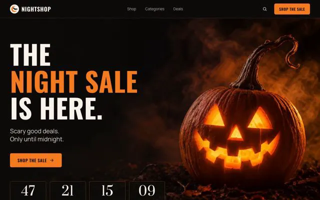
Thirteen sections and eighteen photographs make this the largest Halloween page in the library, and the most work to fill. It is a light page, which is the unexpected choice for the season and usually the right one if you are selling to families: light layouts carry more text before the reader tires, and a Halloween sale aimed at parents has a lot to say about sizes, allergens and delivery.
Use it when you have a range rather than a hero product. The extra sections exist to group things — by age, by price, by category — and a page with one product in it will look thin no matter how good the photography is.
Halloween Candy Brand — the lightest lift
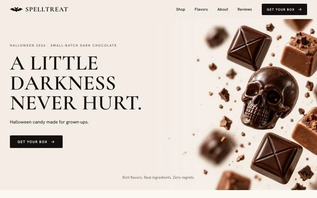
Twelve sections but only twelve photographs, set in a serif. The serif does real work here: it reads as a confectioner rather than a discounter, which matters if your product is handmade or gift-boxed and you are not competing on price.
This is the one to choose for a single seasonal line — a limited box, a flavour that exists for six weeks, a collaboration. It is also the fastest of the seven to get live, which counts when you are reading this in the middle of October.
Costume Shop Editorial — for photography you are proud of
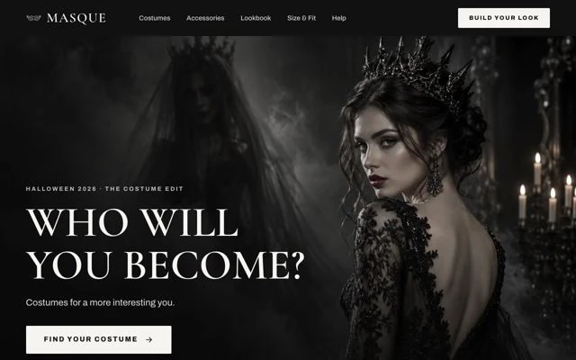
This one treats costume as fashion rather than as novelty. Editorial layout, serif type, fifteen photographs, order form. It gives each image a great deal of room, which is exactly what you want if the photography is genuinely good and exactly what will expose it if it is not.
A practical test before you commit: look at your three weakest images. On this template they will be printed as large as your three best ones. If that thought makes you wince, take Candy Brand instead and keep the imagery tight.
Two that work all season
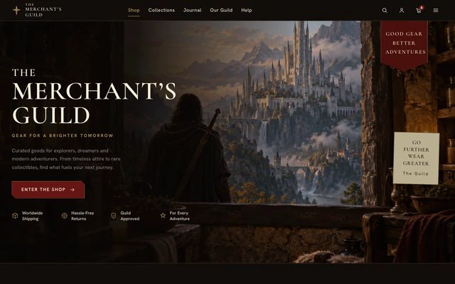
Fantasy Collectibles Shop is dark, eight sections, fourteen photographs, and carries no countdown — because it is a shop, not a sale. That makes it the right home for a range that keeps selling on 1 November, and the wrong one for a deadline offer.
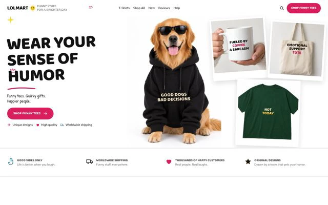
Novelty Merchandise Shop is the playful one, twenty-one photographs, and suits a wide range of small items far better than a single hero product. If your Halloween is forty different things at under £20 each, this is the page shaped for it.
Pages that fill a room
Halloween Manor Party — a ticketed night
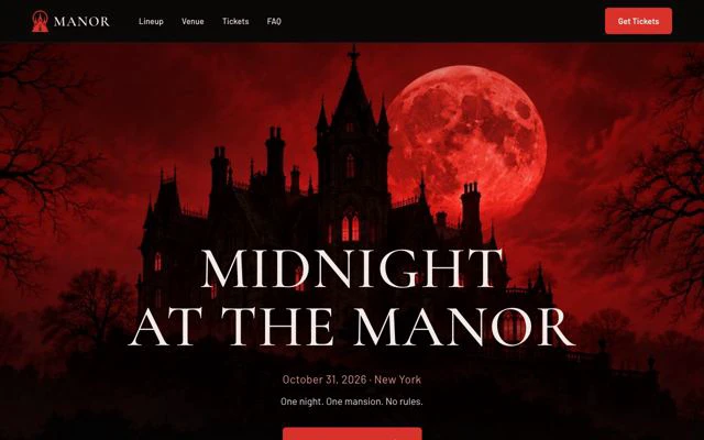
Dark and serif, twelve sections, eleven photographs, with both a countdown and an order form — so people pay on the page. For a Saturday Halloween this is the shape most venues want: a lineup, a time, a price, and a button that completes the sale before the visitor closes the tab.
Eleven photographs is modest, and that is deliberate. An event page is selling an evening that has not happened yet; too many images of last year's crowd start to look like a page about the past.
Haunted House Story — when people do not pay on the page
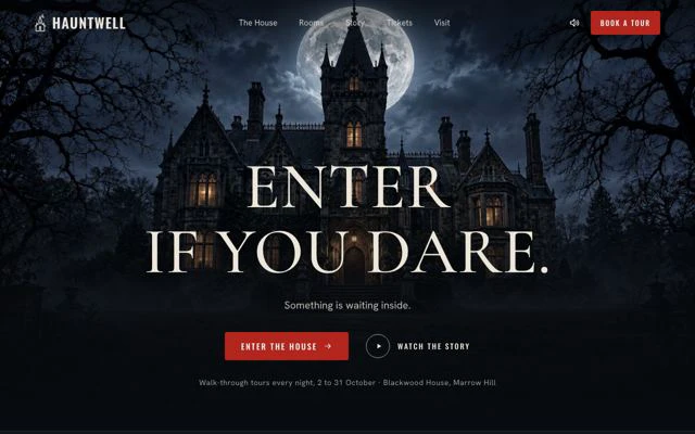
The only page of the seven with a booking feature and an enquiry form rather than an order form. Twelve sections, thirteen photographs, dark and serif.
That is the correct shape for group bookings, private hire, schools, corporate evenings and anything where a slot has to be confirmed before money changes hands. It is also the right page when your capacity is genuinely limited: an enquiry lets you manage a waiting list, where a checkout just oversells you.
Dark or light: the choice most people get wrong
Halloween is the one season where the obvious answer misleads. The dark pages — Manor Party, Haunted House Story, Fantasy Collectibles — suit nightlife, atmosphere and an adult audience. They are dramatic and they photograph well on social.
The light pages — Night Sale, Candy Brand, Costume Shop Editorial — suit families, food and daytime buying. A dark page with four paragraphs of allergen information on it is harder to read than a light one, and if your buyer is a parent choosing a costume for a seven-year-old, readability beats atmosphere every time.
If you want to see the whole set rather than the seasonal ones, the Dark shelf holds forty-eight templates and the events collection holds twenty-six more.
Working back from 31 October
For physical goods the real deadline is your last posting date for Halloween delivery — usually the 27th or 28th — not the 31st. For a ticketed event it is the night itself, but ticket sales concentrate in the final ten days, which means the page has to be live and findable well before that window opens.
A workable order, starting today:
- Choose the template and read its photograph count. That number is your real project plan. Eighteen photographs is a shoot; eleven is an afternoon.
- Gather the images before you start writing. A page waiting on photography is a page that misses the date.
- Write the offer in plain words — what it is, what it costs, when it ends. Or tick write the text for my business when you start, and the AI fits copy to what you actually sell for about 20 credits, keeping the design as drawn.
- Publish by mid-October. That gives the page two weeks to be found and gives you time to fix whatever the first hundred visitors reveal.
- Decide now what the page says on 1 November. A countdown that hits zero with the offer still live teaches every returning visitor to ignore the next one.
Starting from any of these costs no credits: the template opens in the editor with its layout, photographs and sample text, and you change what you need.
What comes next
Twenty-seven days after Halloween is Black Friday, with 11.11 ahead of it — nine templates, and the same photograph-count question decides which one you can actually build. After that, Christmas, where the deadline is your last posting day rather than the 25th, and then New Year, the only page of the five still converting in February.
All five dates, with the lead time each one needs, are in the 2026 seasonal calendar. The whole library is at landing page templates.