For one object people use every day
A single-product page has to answer a short list of practical questions before it can be charming: what it does, how long it lasts, what it costs, how it is cleaned, and what happens if it breaks. Smart Mug DTC keeps that list in order on a calm warm-grey page, with morning-light photography, handwritten notes and black buttons.
It suits direct-to-consumer brands selling one hero product with a few variants, such as a mug, kettle, lamp, speaker or bottle. Pick it when the object belongs in daily life and the page should feel quiet and premium rather than loud.
How the page sells, section by section
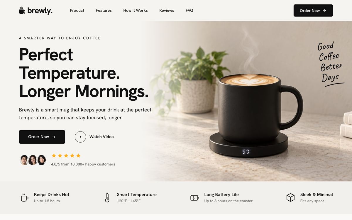
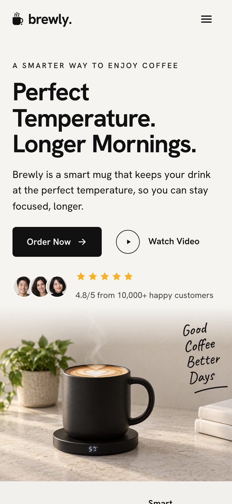
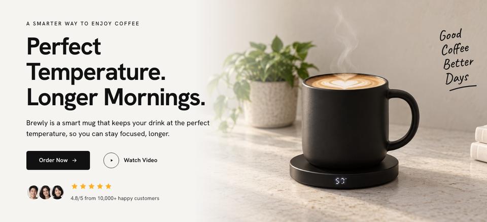
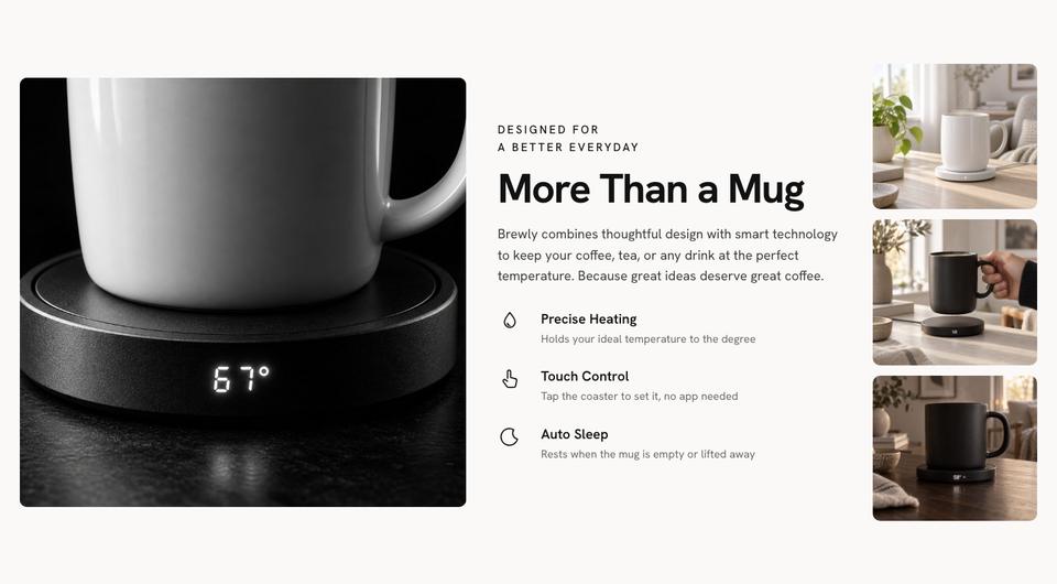
The hero splits a photograph of the product on a warm table from the promise and a rating. A feature strip gives four facts: how long it holds temperature, the range, battery and design. The product section is a monochrome close-up with three details, and a lifestyle split places it in a working day.
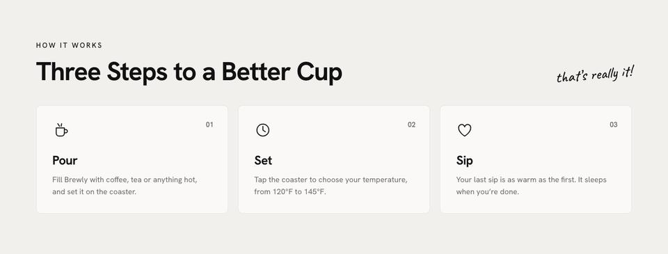
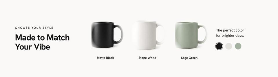
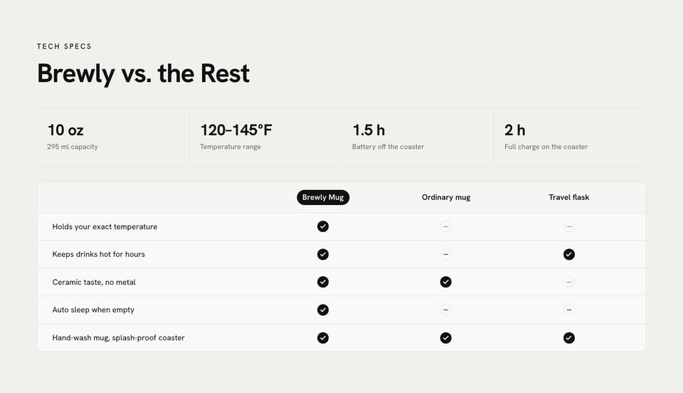
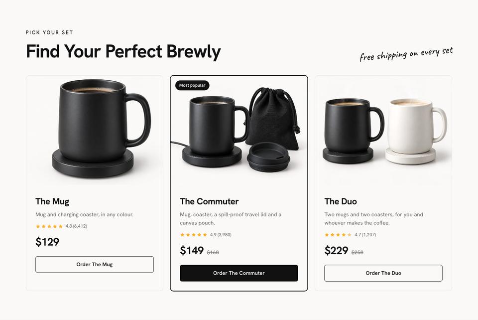
How it works takes three steps, in the words a customer would use. Colours shows the choices with swatches, and specs compares the product with an ordinary mug and a travel flask, which is where a premium price is justified. Sets price the product alone, with accessories and as a pair.
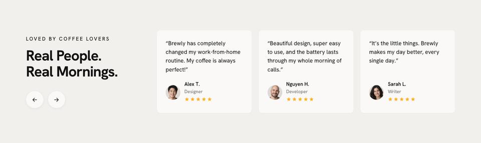
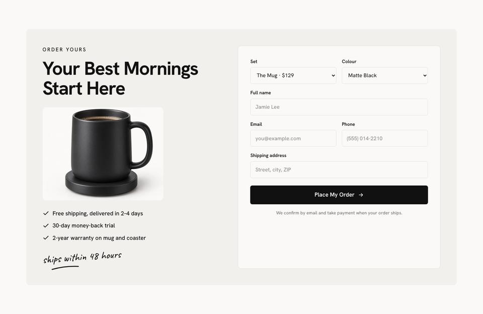
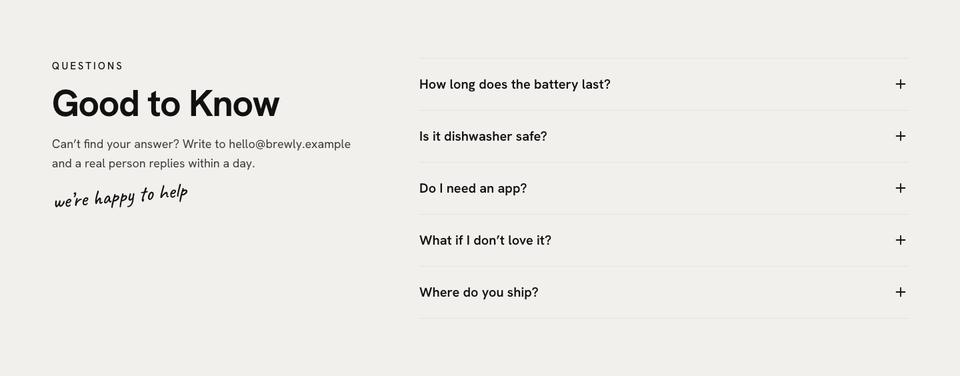
Reviews quote customers by name and use, the order form collects set, colour and address with the delivery and warranty terms beside it, and questions answers battery life, cleaning and care.
Making it yours
Ink, Espresso, Sage and Clay schemes are included, with Hanken Grotesk, Manrope or Plus Jakarta Sans. Thirteen photographs are used, and this layout depends on them: the product in real morning light, close enough to show the material, and in a hand or on a desk for scale.
What to measure before publishing
Test the headline claims yourself on production units: how long the product performs away from power, how long a full charge takes, capacity, weight and dimensions. Publish the range or setting in the units your customers use, and say what conditions the figures were measured in.
The comparison table should be fair. Compare on things that matter, such as how long a drink stays hot, taste, cleaning and whether it sleeps by itself, and describe the alternatives accurately. State care instructions, especially anything that cannot go in a dishwasher, the warranty length and what it covers, and the trial period with who pays return postage.
Writing it with the AI
Start from the template for free, or tick “Write the text for my business” for about 20 credits. A strong brief names the product, the sets and prices, the colours, the measured specifications, delivery times, the trial period and the warranty.
Adapting it for other everyday objects
A lamp can replace the temperature range with brightness and colour temperature, and the sets with bulb options. A speaker usually adds sound specifications and battery life, with a listening note. A water bottle can show sizes and lids instead of colours. A kettle can keep the three steps and add capacity and boil time to the comparison.
Getting the page in front of buyers
A single-product page is the destination for everything: paid social, a creator's video, a gift guide, a search for the product category. Each of those visitors wants a different section first, so make sure the page reads well from any entry point and loads fast on a phone. Because orders arrive with their source and campaign, you can compare the cost of an order from a creator against paid ads, and put the budget where it pays. Refresh the reviews and the photography each season rather than rebuilding the page.
When another template fits better
For a considered object sold on a specification sheet, Single Product Launch gives the table more room. A tech product with hotspots on a large product shot fits Gadget Launch, and a set sold by tier fits Bundle And Save. More selling layouts are on the ecommerce templates page.
Before you publish
- Measure every claim on production units.
- Check the comparison describes the alternatives fairly.
- State care, warranty and the trial period.
- Photograph the product in daylight, including in a hand.
- Test the order form and the confirmation email.