For studios and products that sell on taste
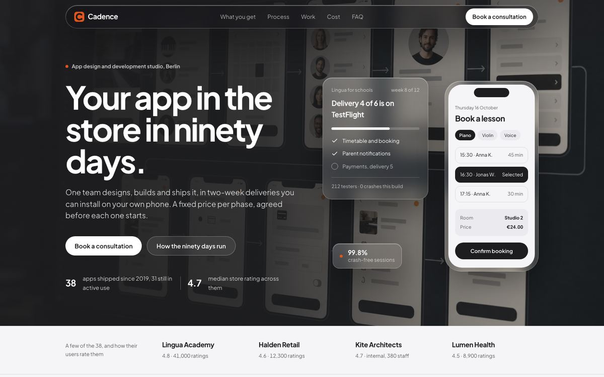
Frosted Glass is the quietest template in the software group. Frosted panels sit only over real photography, actions are black pills, and a single warm dot is the one signal of colour. The result reads as premium without decoration, the register people associate with well-made hardware and apps.
It is written for an app design and development studio, but the same restraint fits wearable and hardware launches, fintech apps and design-led consumer tech. Pick it when the brief asks for a clean, soft, Apple-adjacent look and the offer is sold on craft and reliability.
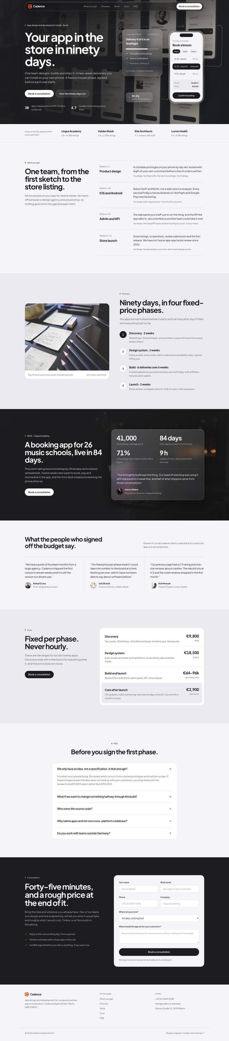
How the page sells, section by section
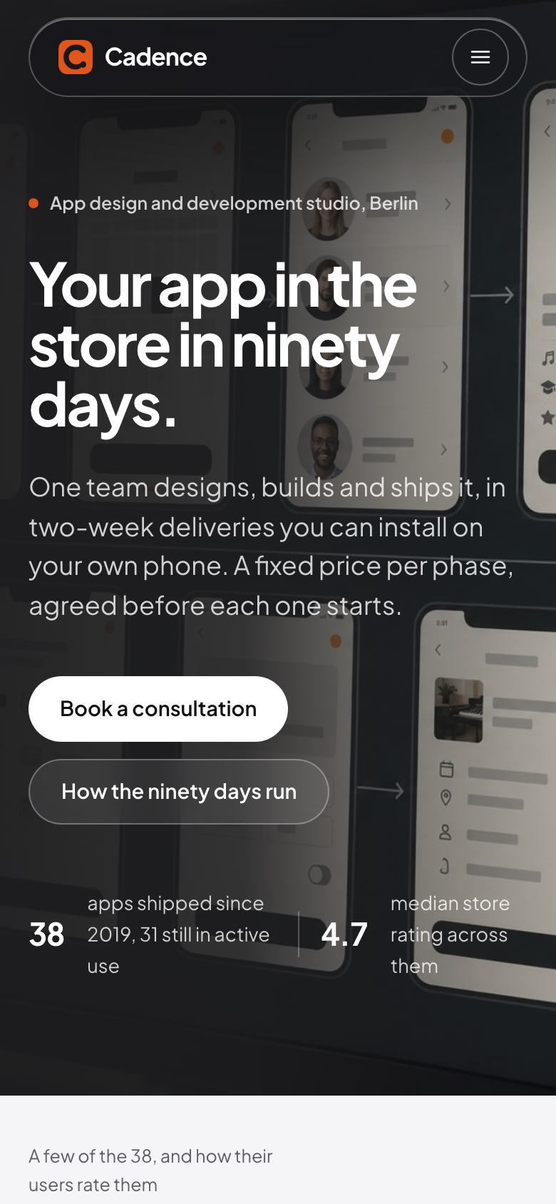
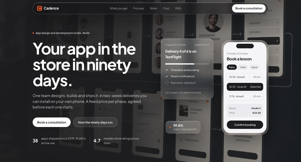
The hero makes a timed promise, “Your app in the store in ninety days”, over a dimmed studio photograph with interface cards floating on glass. A small row of client ratings under the buttons sets credibility before the first scroll.
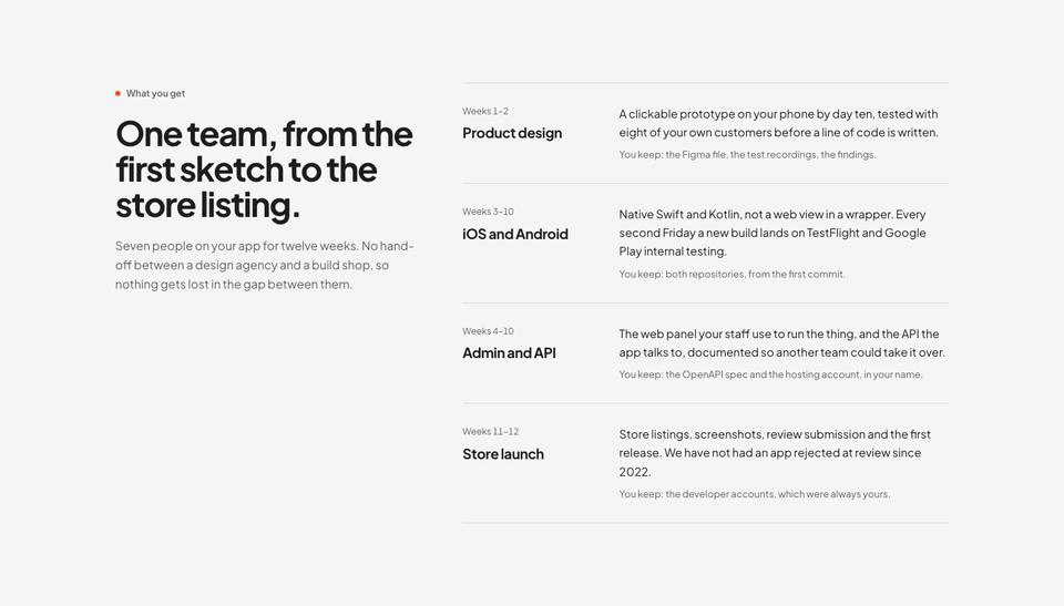
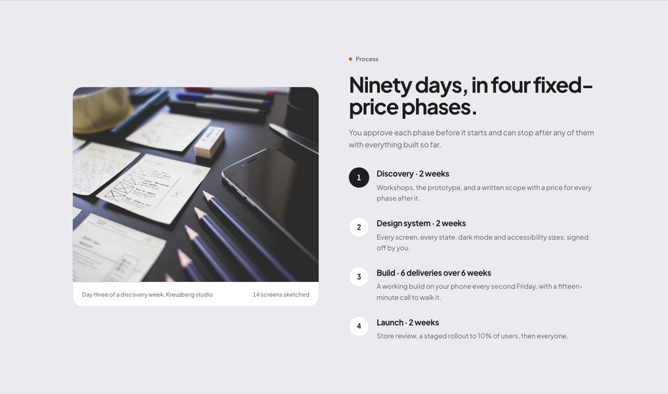
What you get describes the team and the absence of hand-offs, the main worry for anyone who has hired an agency before. Process breaks the work into four fixed-price phases the client approves one at a time, which answers the fear of an open-ended bill.
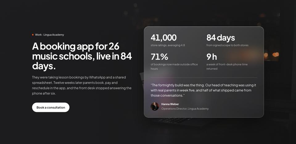
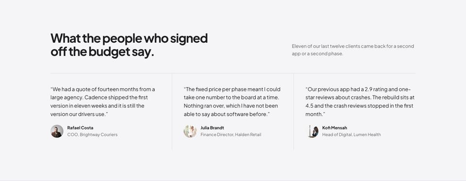
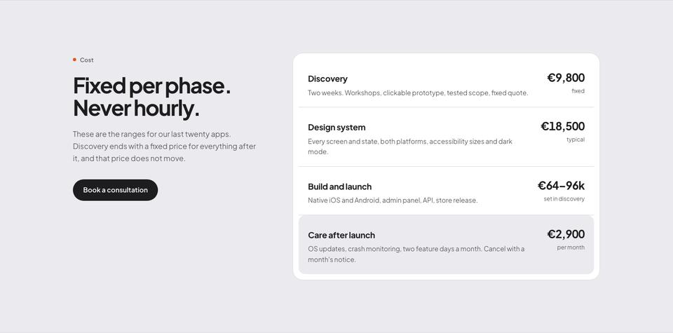
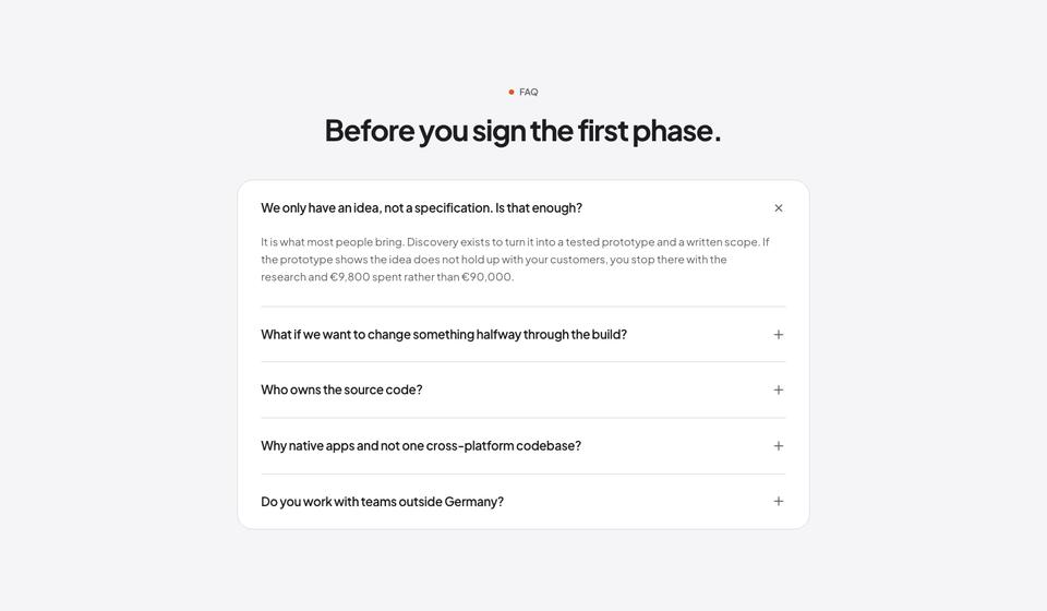
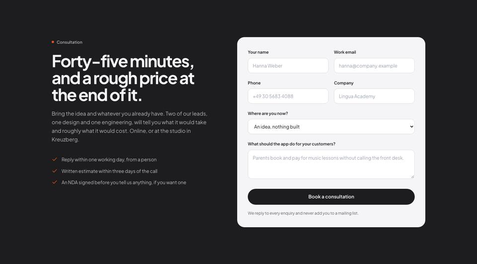
A case study tells one project end to end with numbers and a photograph, followed by client quotes from the people who signed off the budget. Cost publishes ranges from recent projects, questions covers the early doubts (“we only have an idea”), and the page ends with a consultation form that promises a rough price at the end of the call.
Making it yours
Choose between Graphite, Azure, Peacock and Copper. Graphite keeps the near-monochrome look; the others add a single cool or warm accent. Fonts can be Plus Jakarta Sans throughout, Manrope throughout, or Lexend headings over Plus Jakarta Sans body text.
The glass panels depend on the photograph behind them, so replace the sample images with your own studio, product or team shots before changing anything else. Every heading, card and button can be edited in place, and extra sections from the library pick up the same tokens.
Writing the brief
Starting from the template costs no credits. If you would rather not edit by hand, tick the option to have the AI write the text for your business, about 20 credits, and it replaces the sample copy without touching the design. Tell it your timeline promise, how you phase and price the work, one project you can describe with numbers, and what a first call produces.
What a studio needs before publishing
The page makes three promises that need evidence behind them: a timeline, a fixed price per phase, and work that shipped. Before you replace the sample text, pick one project you can describe with numbers, such as the days from kickoff to store approval, the number of users in the first month, or the rating it holds. One well-told case study carries more weight here than a grid of logos.
Next, write down your phases as you actually run them, with what the client approves at the end of each. The cost section works best with honest ranges from recent projects rather than a single “from” price. The photographs matter too: the frost effect only looks right over a real image, so use pictures of your team at work, devices in hand, or the product on a desk, not flat illustrations.
Using it for a product launch instead
Hardware and wearable brands can use the same structure with different content. The process section becomes the specification, the case study becomes a day with the product, and the cost section becomes editions or bundles. A fintech app can turn the work section into a walkthrough of the first transfer, and the enquiry form into an invite or waitlist request. Keep colour to a single accent, since the calm, almost monochrome look is what makes the frosted panels feel premium.
When another template fits better
Frosted Glass depends on good photography and a restrained brand. If you do not have images yet, SaaS Conversion relies on drawn product surfaces rather than photos. An agency that wants more colour and energy than this page allows may prefer Bold Agency or Digital Studio, which keep a portfolio feel with a louder voice. For an IT services firm selling projects to larger companies, IT Solutions is more corporate and shows service lines and certifications.
Browse the full SaaS and software collection or the agency and studio templates.
Before you publish
- Swap all six sample photographs; the frosted effect only looks right over real images.
- Confirm the phase prices and durations match your current proposals.
- Get written approval for the case study and quotes you use.
- Decide whether the consultation form should ask for budget; it filters, but it also deters.