For tools engineers choose for themselves
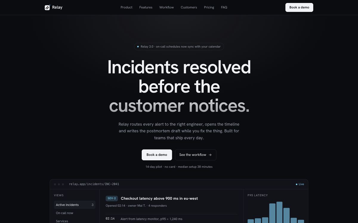
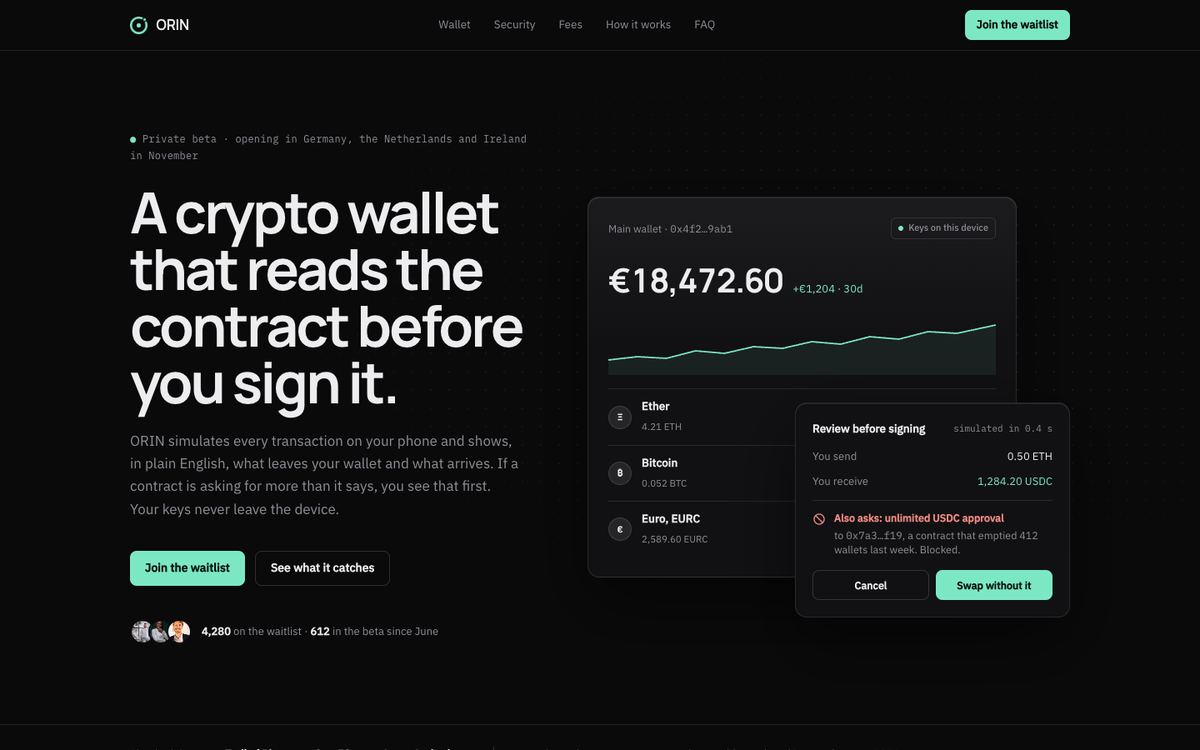
Engineers evaluate a tool the way they read code: quickly, skeptically, looking for specifics. Developer Tool is near-black with hairlines, a single white primary button and the product surface drawn directly in the page. It is quiet and keyboard-first, and it ends on a demo that uses the visitor’s own data.
It suits developer tools, infrastructure and API products, DevOps and observability platforms, AI coding tools and technical B2B SaaS sold to engineers. Choose it when the buyer writes code and the brief wants a dark, minimal product page with numbers.
How the page earns a demo
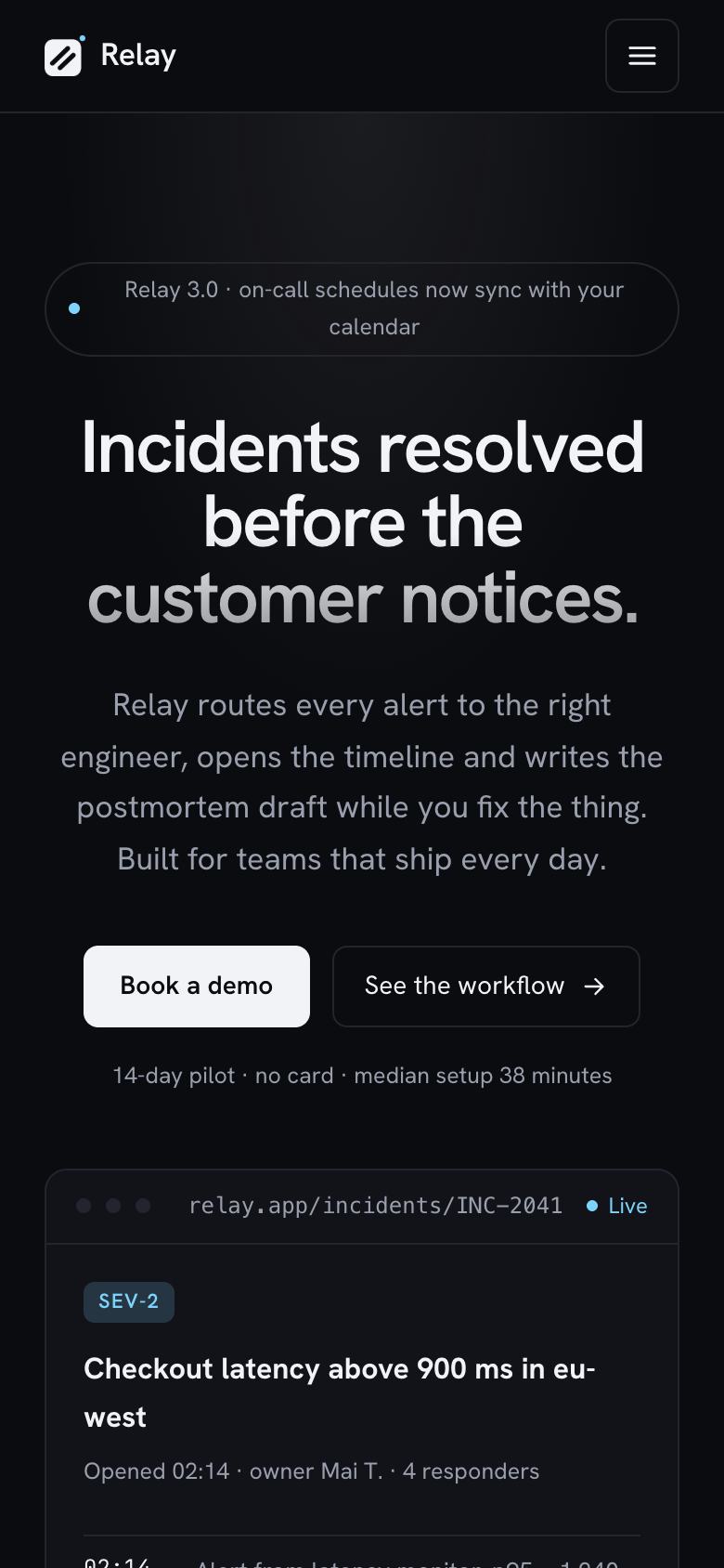
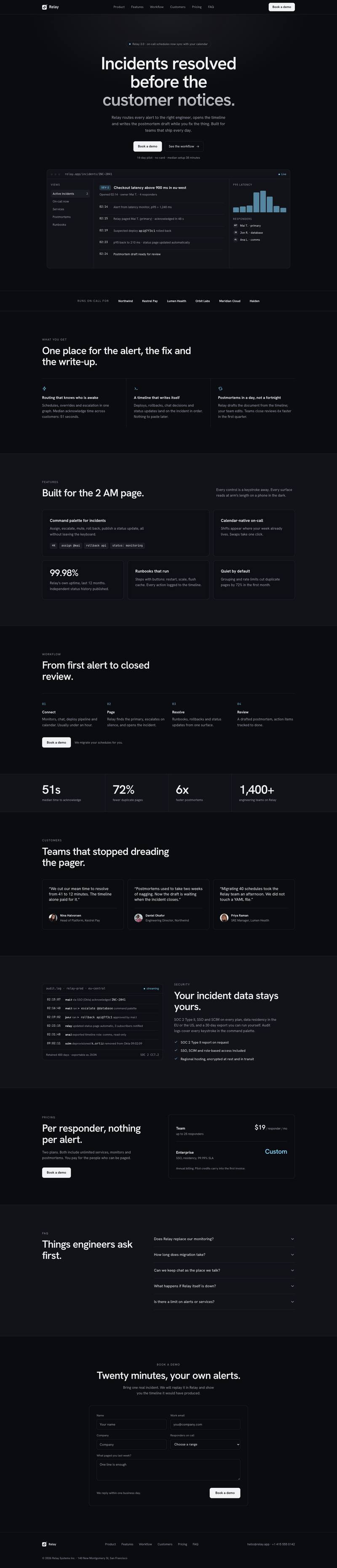
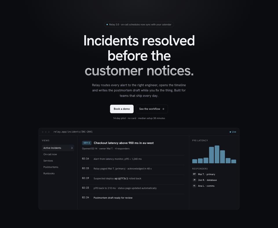
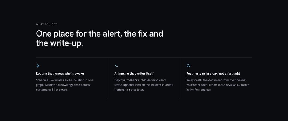
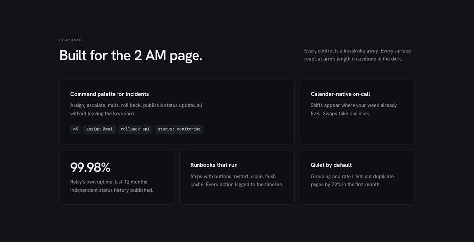
The hero states the outcome, “Incidents resolved before the customer notices”, above a release note and a drawn product surface. What you get is a bento of capabilities, each with one metric, and features is written for the worst moment of the job, such as a 2 a.m. page, with keyboard shortcuts and mobile readability.
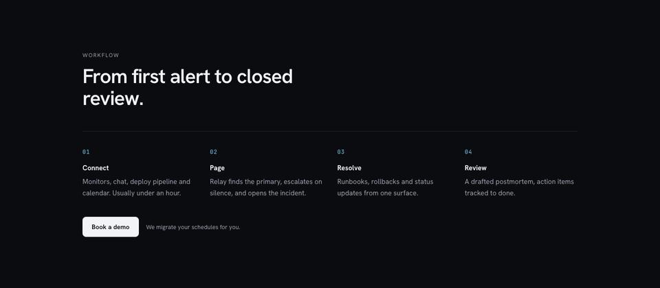
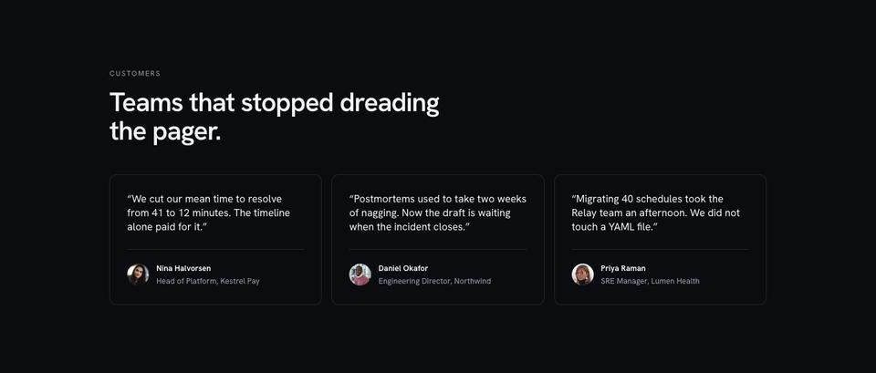
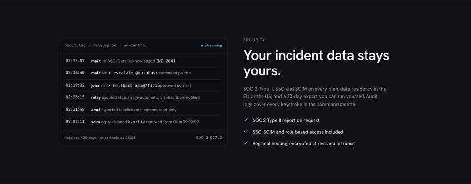
Workflow goes from connecting tools to closing the review in numbered steps. A numbers band gives acknowledge time, fewer duplicate pages, faster write-ups and number of teams. Customers quote engineering leaders with before-and-after figures, and a data and audit section shows a live-looking audit log to answer security questions.
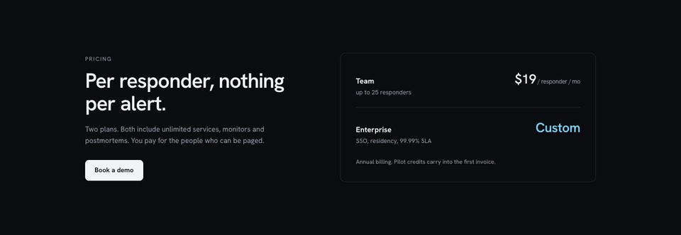
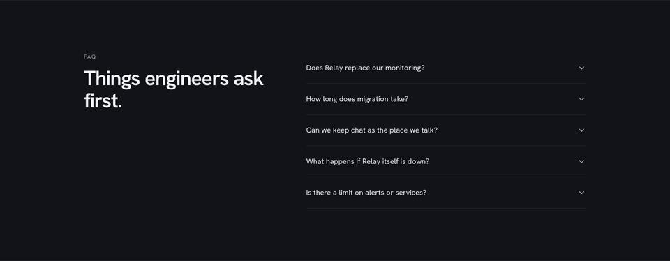
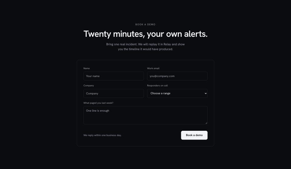
Pricing charges per responder and nothing per event, questions handles the objections engineers raise first, such as whether the tool replaces monitoring, and the page ends with a demo form that replays one of the visitor’s incidents.
Making it yours
Four schemes are included: Mono, which keeps the page black and white, and Sky, Amber and Mint, which add one accent. Headings can be Hanken Grotesk, Manrope or Lexend. Only three photographs are used, so the template looks finished with no images at all.
The drawn product surfaces are ordinary page elements you can edit, and any section can be rewritten by selecting it and asking the AI, for example to swap incident response for your own product’s workflow.
Writing it for your product
You can start from the template for free, or have the AI replace the sample text with copy for your tool for about 20 credits, keeping the layout. Tell it the job the tool does, the integrations, the metric you improve, how teams set it up, how you charge and what the demo shows.
Material engineers will look for
Developers read product pages sceptically and skip anything that sounds like marketing, so prepare concrete material. The product section is drawn in HTML rather than screenshots, which means you describe real states: an alert routed to the right person, a command run from the palette, a timeline filling in. Note the keyboard shortcuts, integrations and API capabilities you want to show, and make sure each one exists today.
The numbers band should come from product telemetry with a clear definition, such as median time to acknowledge across all customers last quarter. Customer quotes work best from engineering leads with a measurable change in their own words. The security and data section needs specifics: where data is hosted, retention, SSO and audit logging, and certifications you actually hold. Pricing should name the unit, whether per responder, per seat or per usage, and what is unlimited.
Infrastructure, observability and AI coding tools
An infrastructure or API product can replace the workflow with a short quick-start, three commands from install to first result. Observability platforms usually lead with the dashboards and the query language, and state data ingestion prices clearly. AI coding tools can show a diff or suggestion inside an editor as the hero, and add a section on what code leaves the machine, which is the first question most engineering managers ask.
When another template fits better
Developer Tool is spare and dark. If your buyer is not an engineer, SaaS Conversion explains a product more fully on a light page. Analytics and observability products where charts are the pitch fit Data Panel, AI assistants suit AI Product, and documentation or knowledge tools read better on Workspace Document. For an indie or hardware product with attitude, look at Raw Monospace.
See the whole SaaS and software collection.
Before you publish
- Replace the drawn product states with your own interface.
- Check every metric in the numbers band is measured and dated.
- Make the security and data section match your actual practices.
- Keep the demo form short: name, work email, company.