For software that is sold in a meeting
Most B2B products are not bought from the landing page. They are bought after a call, by a person who had to justify the call to someone else first. SaaS Conversion is built for that path. The first screen shows the product doing its job, the middle of the page answers the questions a buyer gets from finance and IT, and the only action at the end is a demo request.
It suits anything with a login and a technical or operational buyer: e-signature and document tools, payroll and HR platforms, CRMs, developer APIs, analytics dashboards. If your brief mentions integrations, seats, tiers or a free trial, this is a natural starting point.
How the page sells, section by section
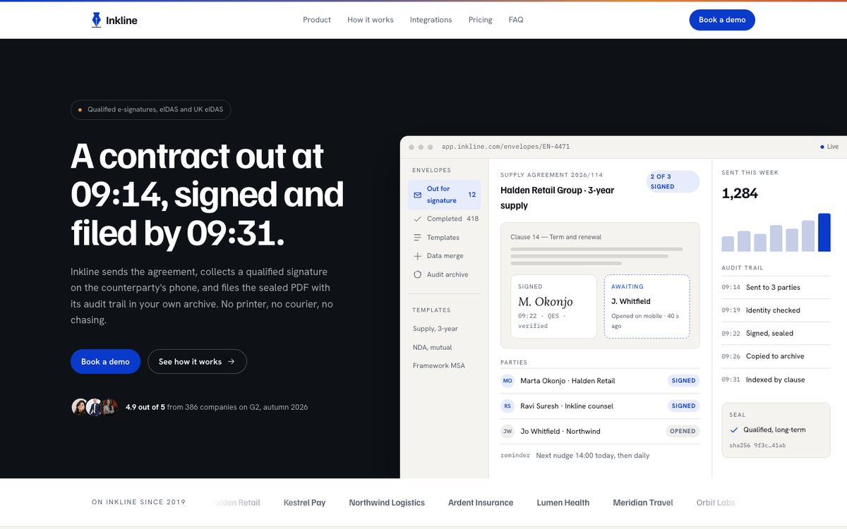
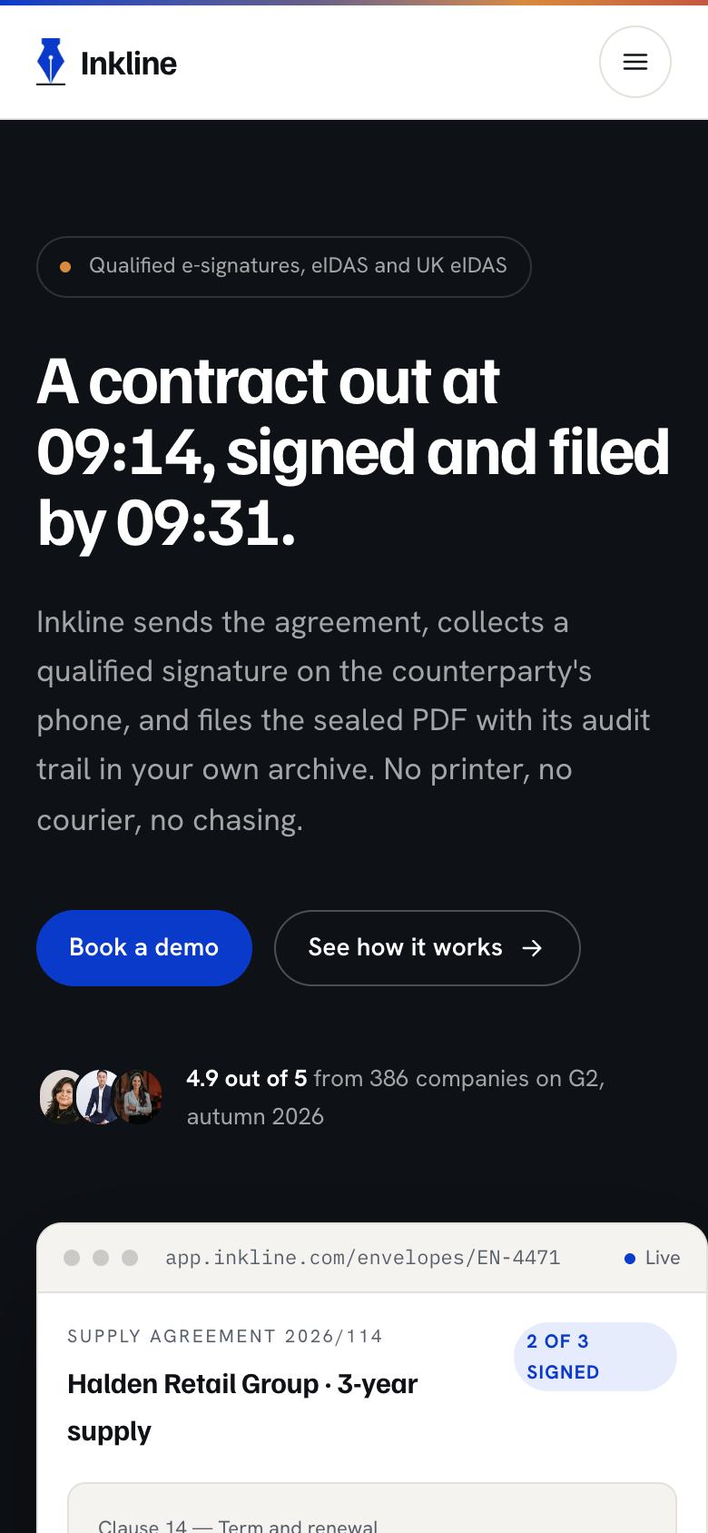
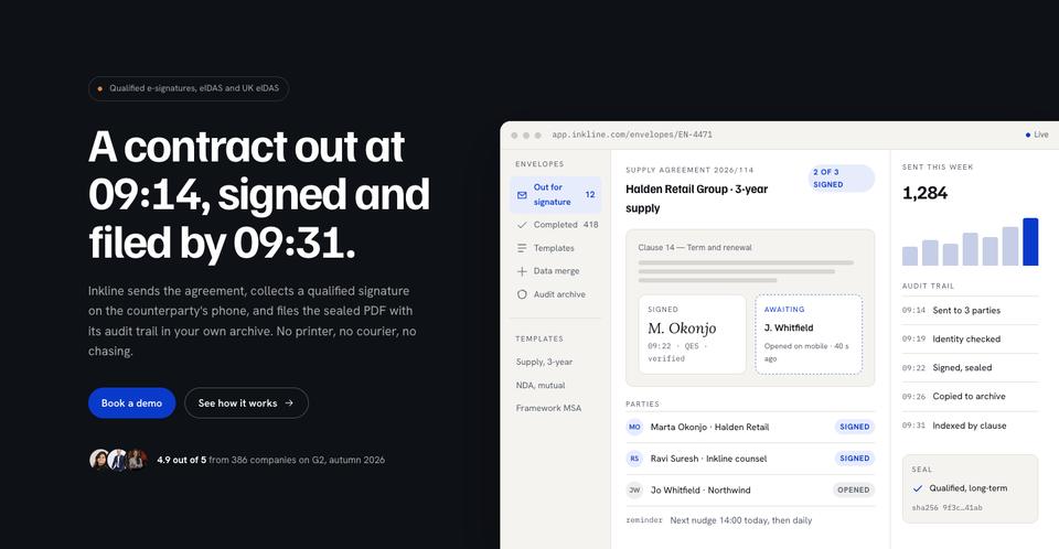
The hero pairs a concrete promise with the product itself, flush to the edge of the screen, so the visitor sees an interface before reading a paragraph. The sample line, “A contract out at 09:14, signed and filed by 09:31”, shows the pattern worth keeping: a timed, specific outcome instead of an adjective.
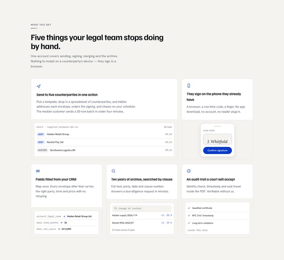
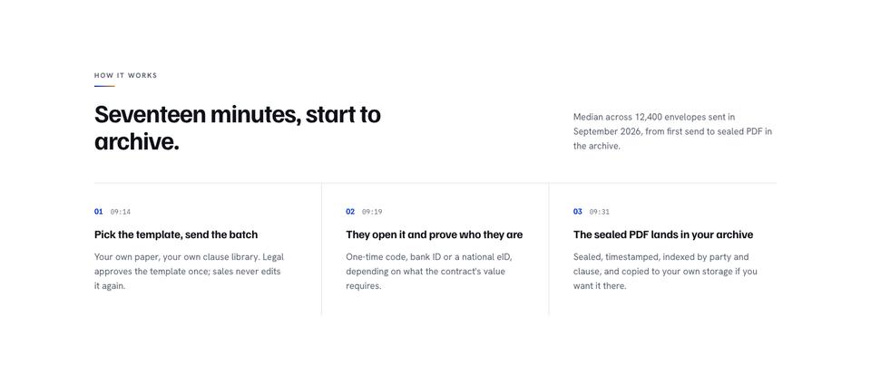
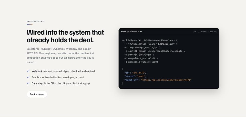
What you get is a bento grid. Each cell is a drawn surface for one capability, which keeps five features readable without five screenshots. How it works turns the workflow into timed steps, and Integrations names the systems a buyer already uses, the fastest way to answer “will this fit?”
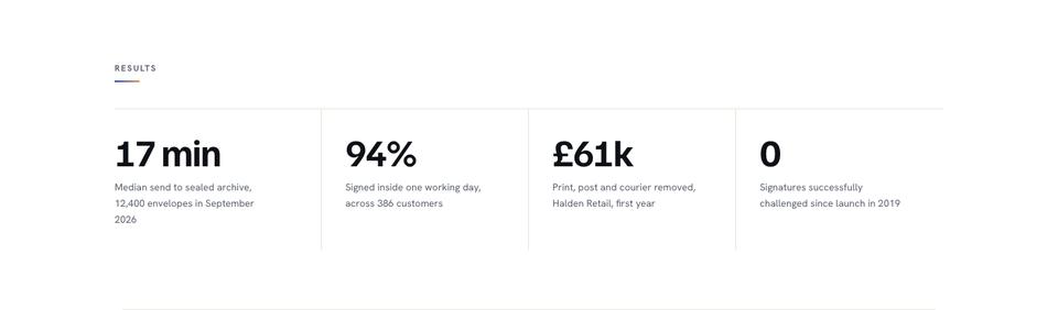
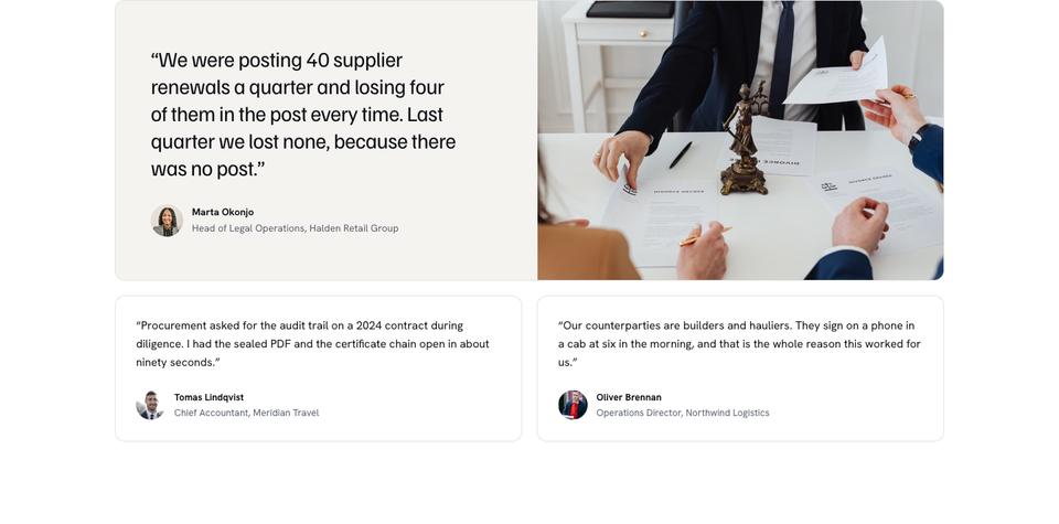
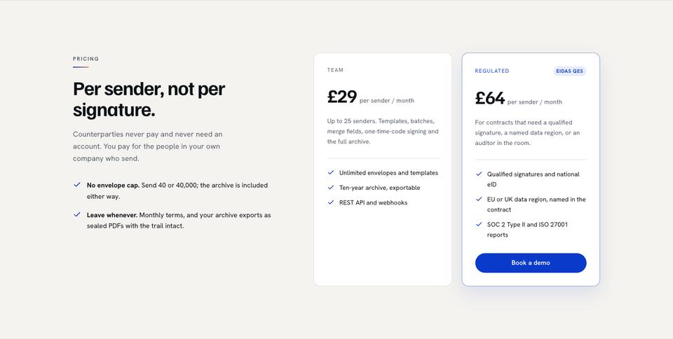
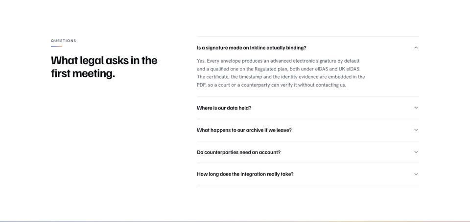
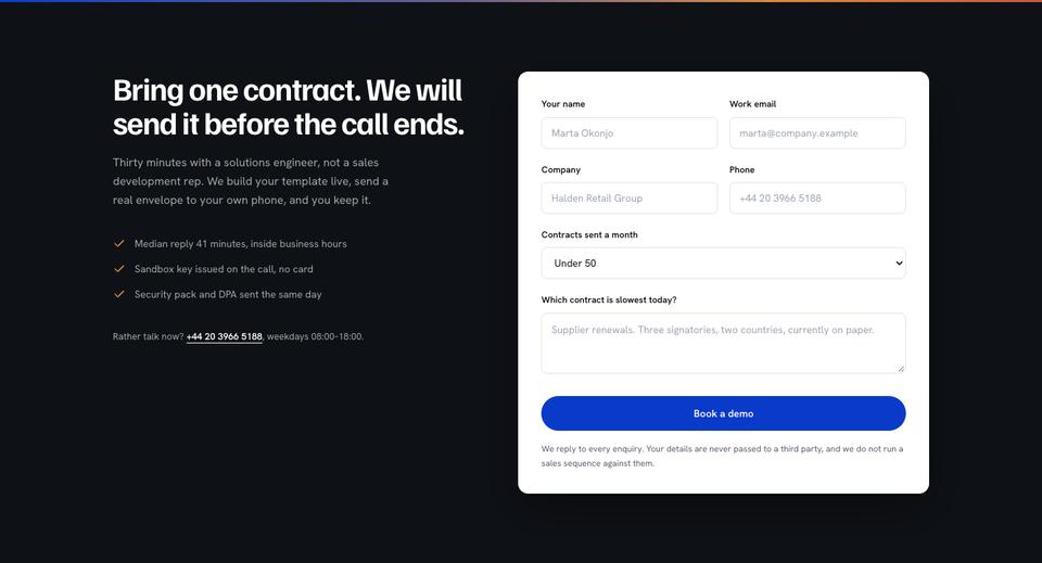
A band of results in numbers and a single customer quote carry the proof. Then pricing explains the unit you charge on, because “per what?” is the question that stalls procurement. Questions handles the objections a legal or security reviewer raises, and the page closes on a demo form that says exactly what happens in the call.
Making it yours
The page ships with three colour schemes, Cobalt, Emerald and Rust, and three type pairings: Familjen Grotesk with Hanken Grotesk, Manrope throughout, or Hanken Grotesk throughout. Changing either repaints every section, because colours and type are page tokens rather than styles on individual blocks.
In the editor you can click any heading or card and change it, ask the AI to rewrite only the selection, or add sections from the library. If you sell on a free trial rather than a demo, rename the form's button and heading; nothing else in the structure has to move.
Using it with your own words
There are two quick routes. Start from the template as it is, at no credit cost, and edit the sample text yourself. Or tick “Write the text for my business” and describe your product: the AI replaces the sample copy across the page and keeps the design exactly, for about 20 credits.
A good brief for this layout names the product, the buyer’s job title, the one outcome you can time or count, the systems you integrate with, and how you charge. Those five facts fill the hero, the steps, the integrations band and the pricing without guesswork.
Adapting it beyond e-signature
The sample company sells signatures, but every band maps onto other B2B products with little rework. For a payroll or HR platform, the timed steps become a pay run from import to payslips, and the integrations band lists the accounting and HR systems you sync with. For a CRM, the bento cells become pipeline, sequences, reporting and permissions, and the results band counts deals moved or hours of admin removed.
Developer platforms change the most in the middle: replace the customer quote with a short code sample or an uptime figure, and point the integrations band at SDKs and languages. Analytics tools can keep the numbers band as it is and give the hero a chart instead of a document. In each case the pricing section still has to name the unit, whether that is a seat, a sender, an API call or a tracked user, because that single line saves the most back-and-forth later in the sale.
When another template fits better
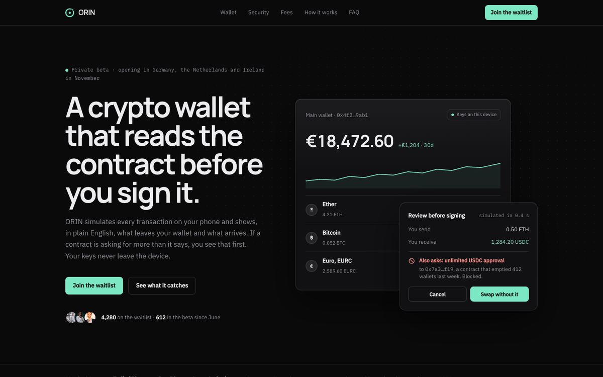
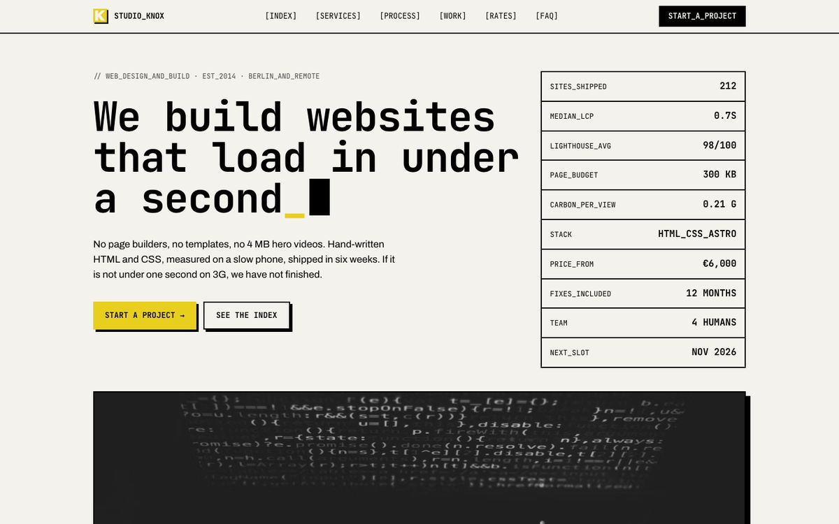
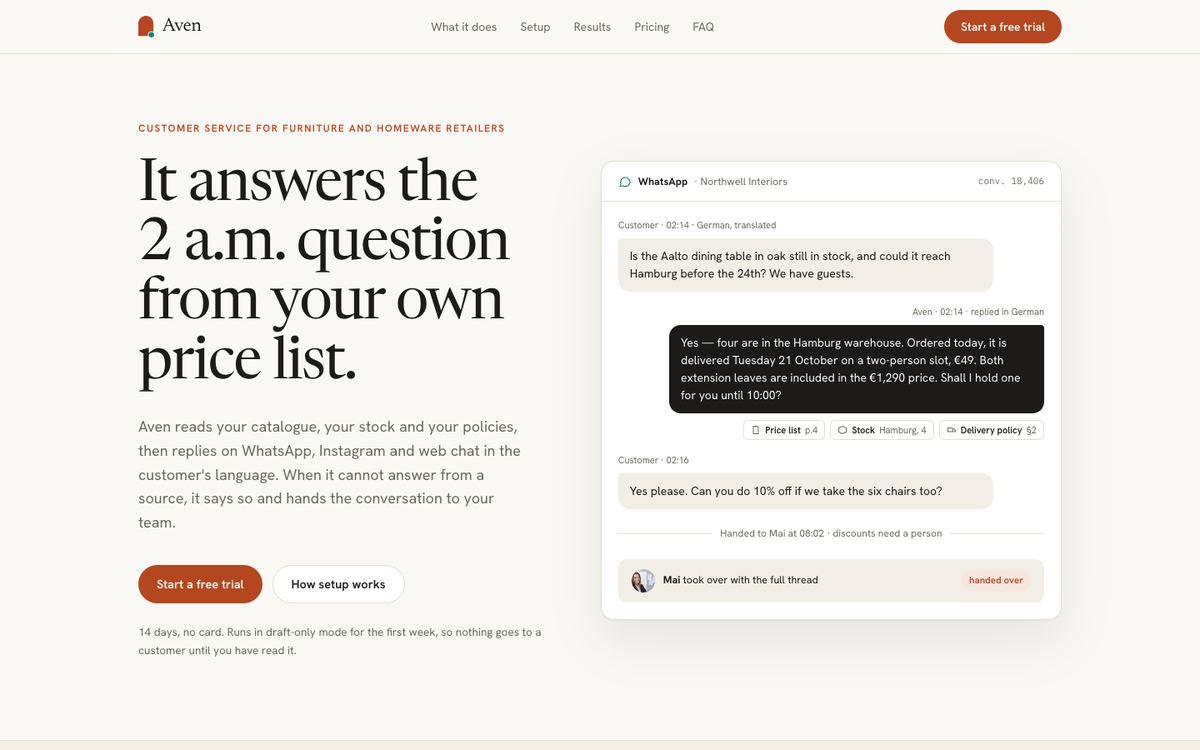
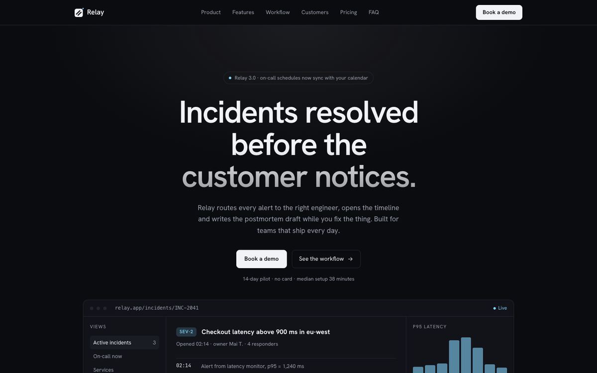
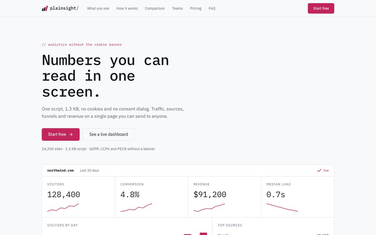
SaaS Conversion assumes a light page and a buyer who wants the product explained. If your audience is developers who judge a tool by its changelog and CLI, Developer Tool is darker and terser. If the product is an assistant or agent whose answers need to look trustworthy, AI Product leads with a transcript instead of an interface. For analytics and observability, where a chart is the pitch, Data Panel gives the numbers more room. And if you sell a crypto or trading product, Web3 keeps the same discipline on a near-black ground.
The SaaS and software templates page lists every software layout side by side.
Before you publish
- Replace the seven sample photos and product surfaces with screenshots of your own interface.
- Check every number in the results band is one you can defend in a sales call.
- Decide what the demo form should ask; fewer fields usually means more requests.
- Connect your domain and the tracking destinations you use, so demo requests arrive with their campaign.