For AI products that have to be believed
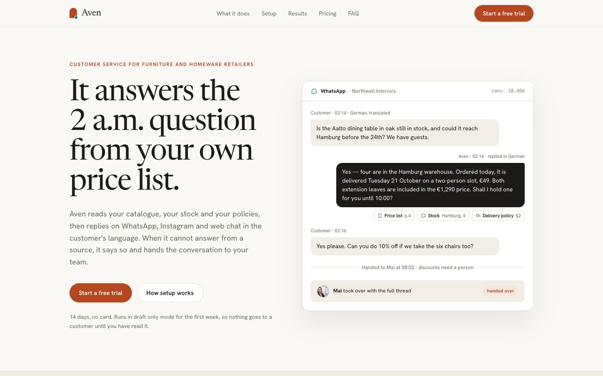
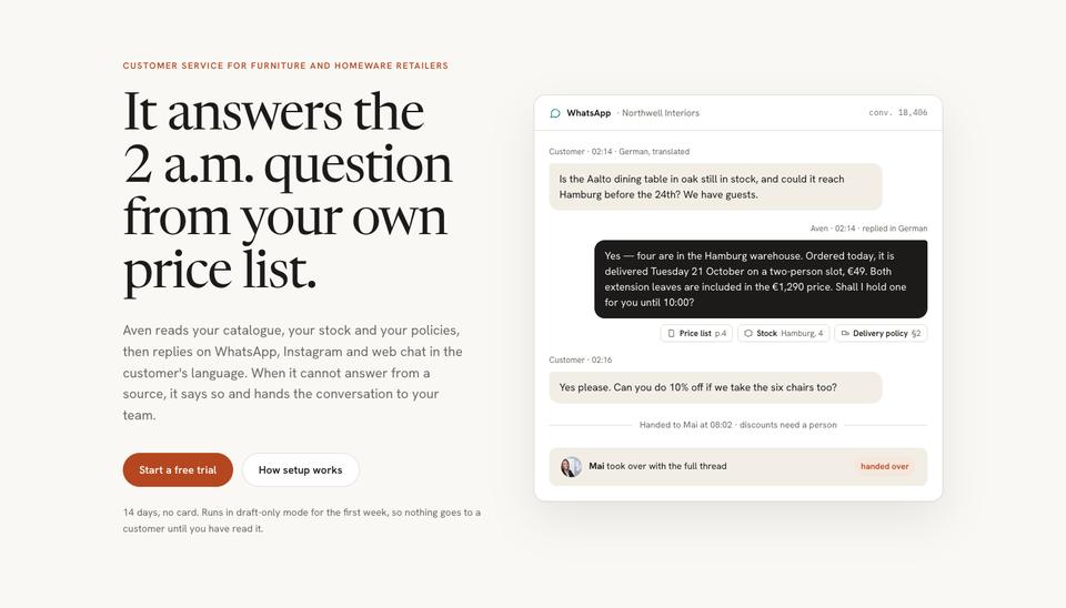
Visitors arrive at an AI product page expecting to be oversold. AI Product is designed to do the opposite. It uses warm paper, a serif display face and a real conversation as the hero, with the source of each answer printed under it. The effect is closer to a well-edited report than a launch video, which is what a careful buyer wants before handing a tool their customers or their data.
It fits customer-service agents, copilots, AI search, research and analytics tools, and automation agents. Choose it when your brief needs the page to feel calm and specific about what the product can and cannot do.
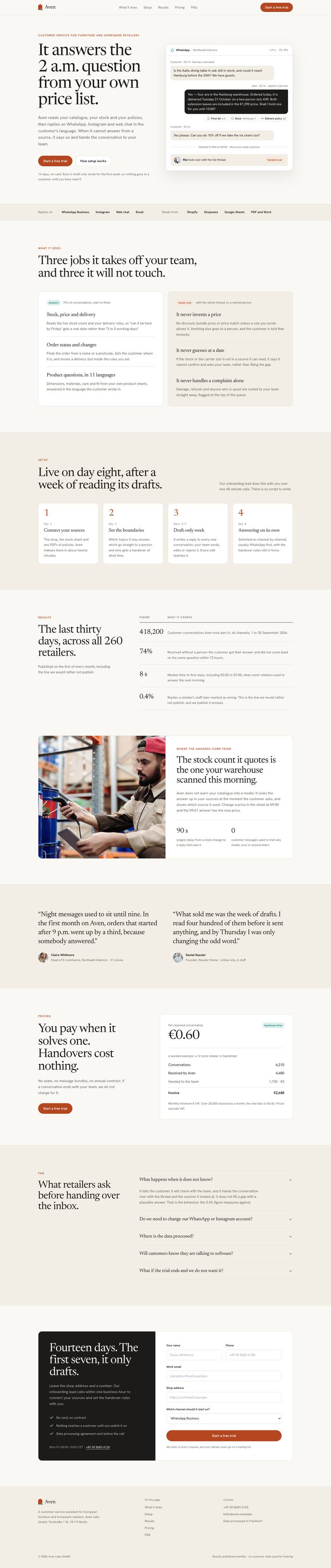
How the page sells, section by section
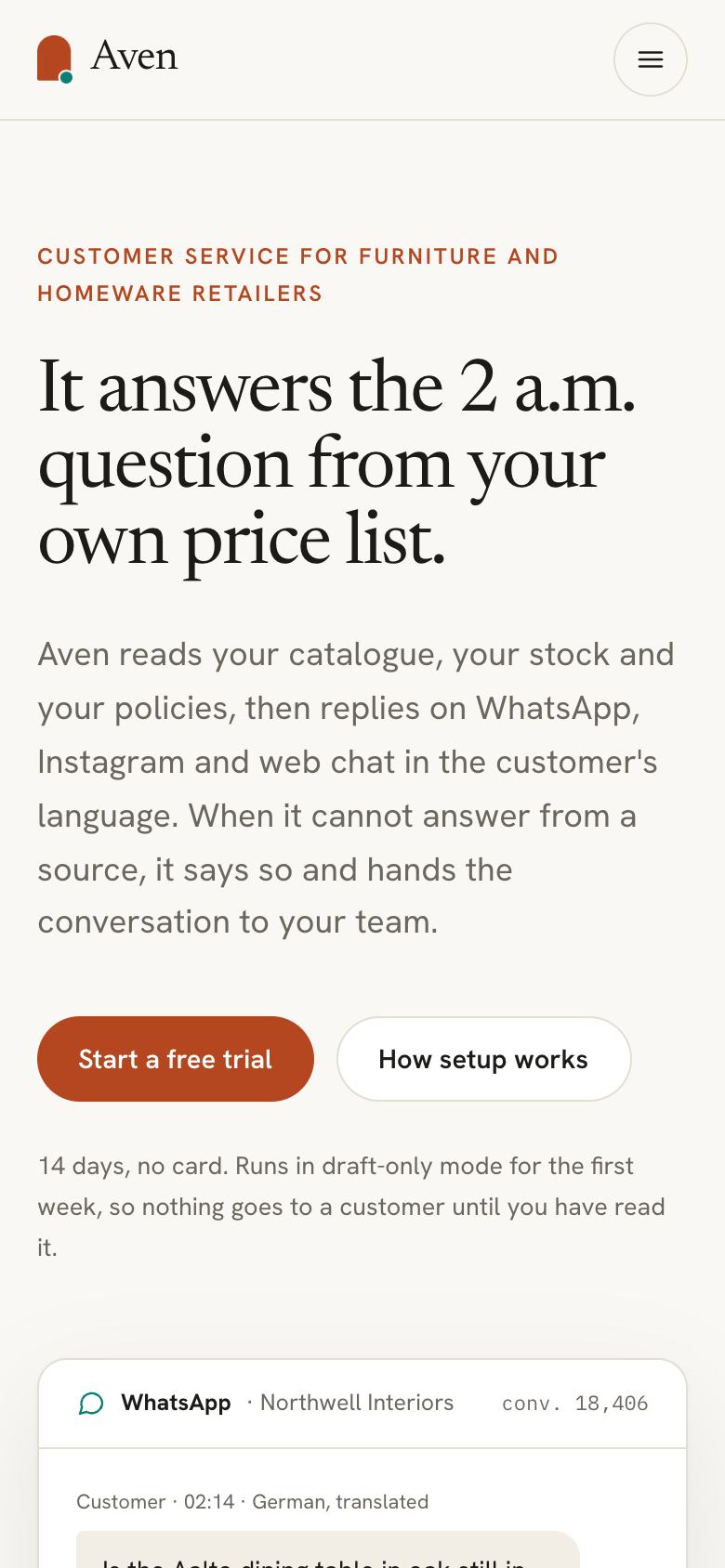
The hero puts a transcript front and centre. The sample, “It answers the 2 a.m. question from your own price list”, pairs a moment of need with the product’s grounding in the customer’s own data. Keep that structure: when, what, from where.
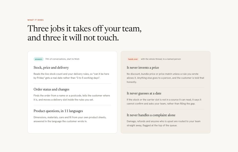
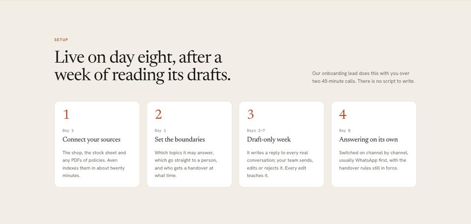
What it does lists three jobs the assistant takes on and three it deliberately leaves to people. Naming the limits is the section that lowers the most resistance. Setup lays out the first week as dated steps, so “implementation” stops sounding like a project.
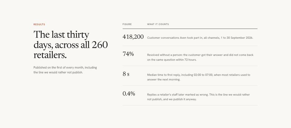
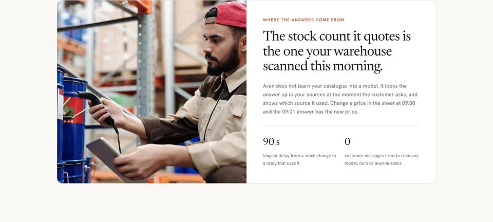
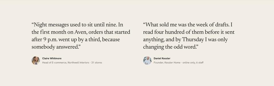
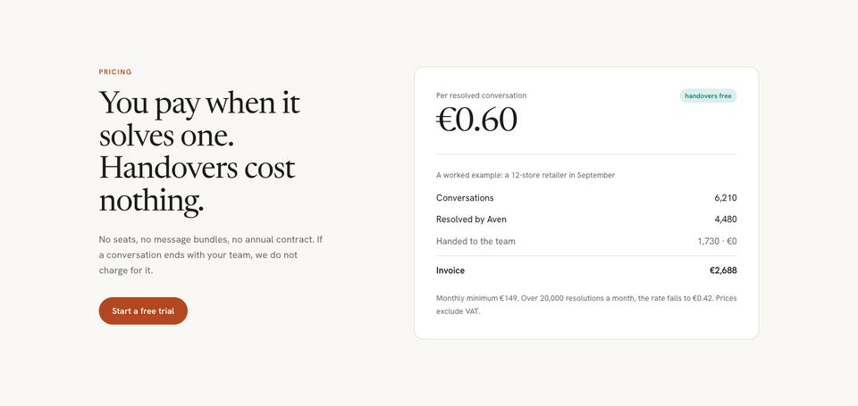
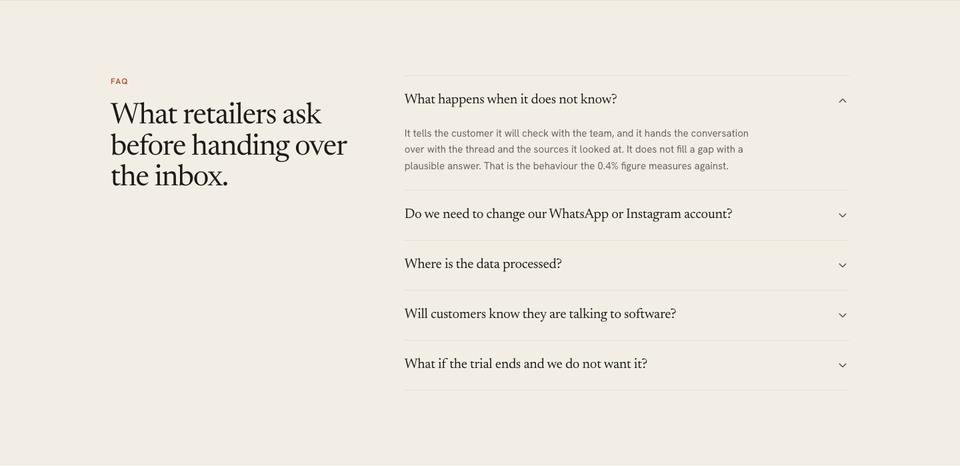
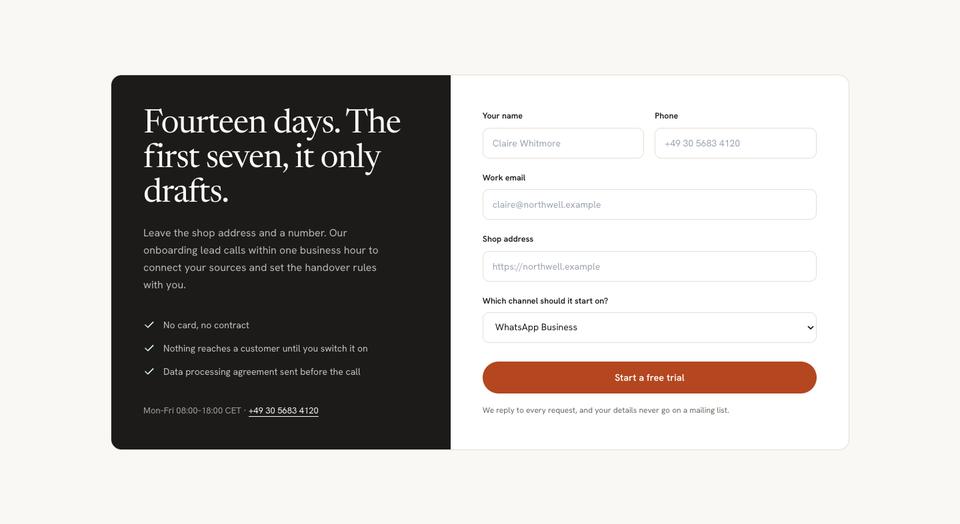
Results publishes the last thirty days in a table, including the figure you would rather not show. Where the answers come from explains the data path in plain language, and a customer quote gives one concrete before-and-after. Pricing ties cost to outcomes, questions covers what happens when the assistant does not know, and the page ends with a trial form that explains the drafting-only first week.
Making it yours
Four colour schemes come with it: Ember, Graphite, Peacock and Olive. Type pairings are Newsreader with Hanken Grotesk, Lexend with Hanken Grotesk, or Hanken Grotesk alone if your brand has no serif. Scheme and fonts are page-wide settings, so a change reaches the transcript cards, tables and buttons together.
Use the editor to replace the transcript with a real exchange from your product, and ask the AI to tighten any section you select. If you need a comparison with other tools, add one from the section library between results and pricing.
Writing the brief
You can start from the template for free and edit by hand, or let the AI replace the sample copy for about 20 credits while keeping the layout. For this page the brief should say what the product answers or automates, whose data it reads, what it refuses to do, how long setup takes and how you charge. Include one real question a customer asked; it becomes the hero.
What to have ready before you start
This layout depends on real material more than most. The hero needs one genuine exchange between a customer and your assistant, trimmed to three or four turns, with the source each answer came from. The results band needs a month of figures: how many conversations were handled end to end, how many were handed to a person, and the average time to an answer. If you publish a line that is not going well yet, the page reads as more honest, not less.
You will also want a plain list of what the product will not do. The “three it will not touch” cells are where a cautious buyer decides whether the tool is safe to switch on, so write them as specific refusals, such as refunds, legal complaints or anything involving a payment card, rather than general promises about safety.
Using it for copilots, search and agents
For a writing or coding copilot, keep the transcript hero but show a suggestion inside the tool with the file or document it drew from. For AI search, the “where the answers come from” section becomes the centre of the page: which sources are indexed, how often they refresh, and what happens when nothing relevant is found. Automation agents usually swap the transcript for a short activity log, one task per line, with the step where a human approved it.
When another template fits better
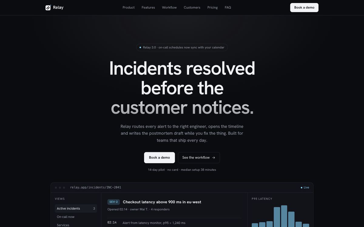
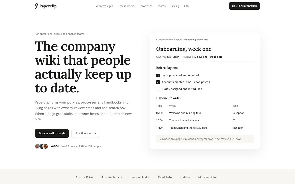
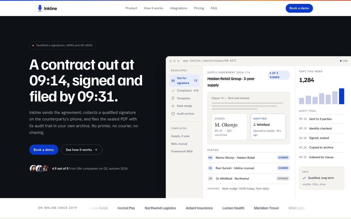
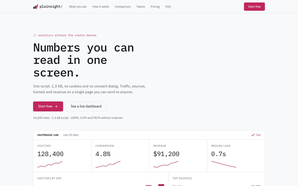
AI Product works best when the product speaks in answers. If yours is an interface people click through, such as a dashboard or workflow tool, SaaS Conversion shows the product surface instead of a conversation. Developer-facing AI tooling often reads better on the dark, command-line feel of Developer Tool, while a writing or knowledge product may suit the document-style pages of Workspace Document. For analytics built on a model, Data Panel gives charts the first screen.
See all of them together on the SaaS and software templates page.
Before you publish
- Replace the sample conversation with one you have permission to show.
- Make sure every result in the table has a date range and a source.
- Write the limits section yourself; it is the part buyers read twice.
- Point the trial form at the fields your onboarding team actually needs.