For products whose pitch is a chart
Buyers of analytics and monitoring tools have seen a hundred screenshots of dashboards. What convinces them is a panel they can read in a glance, an honest comparison and a price that does not punish growth. Data Panel is a light template with a monospace display face, charts with visible gridlines and a single raspberry accent that puts the product’s numbers ahead of the adjectives.
It suits analytics, observability and monitoring products, BI and reporting tools, developer APIs and data platforms. Choose it when the brief should show the product as real panels and tables.
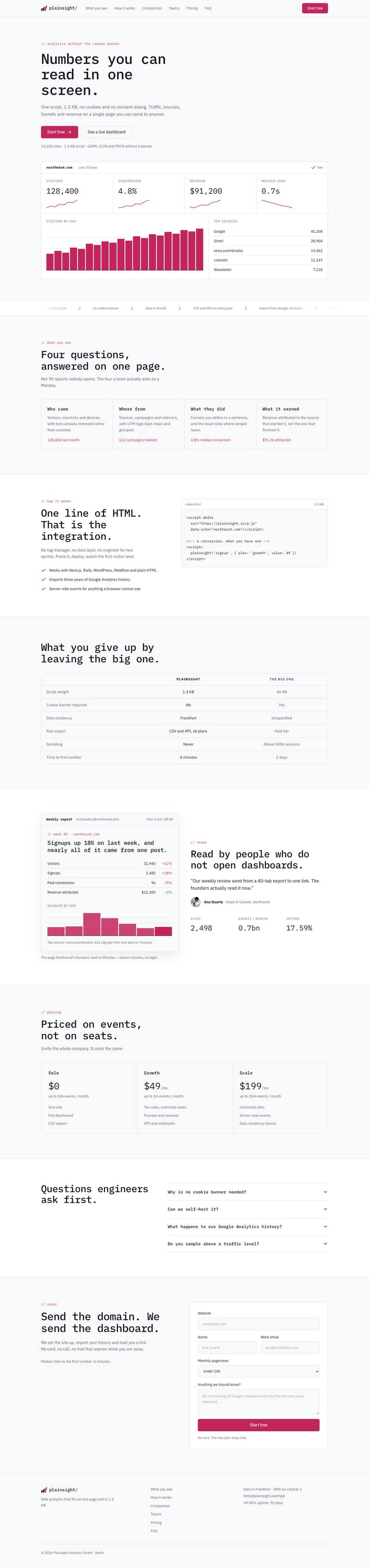
How the page makes the case
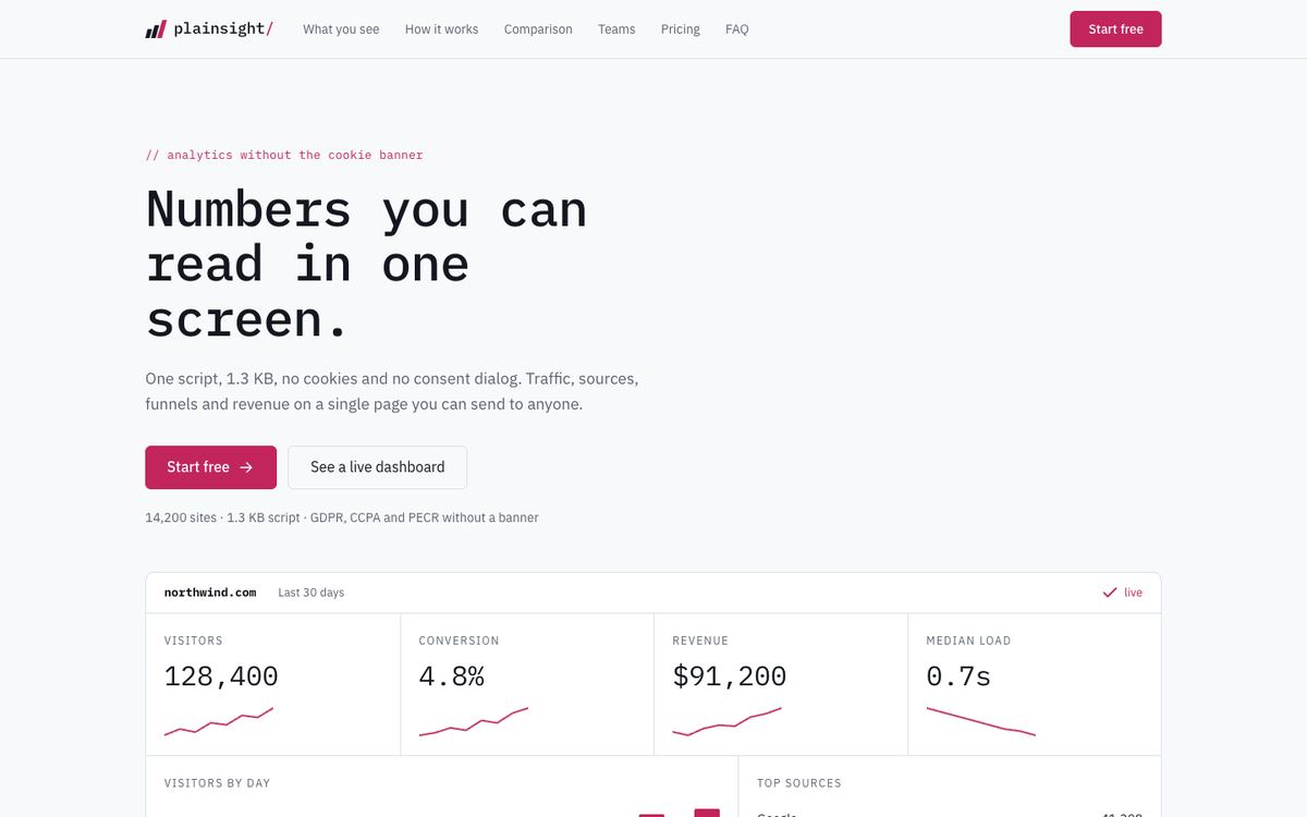
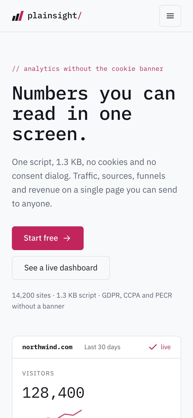
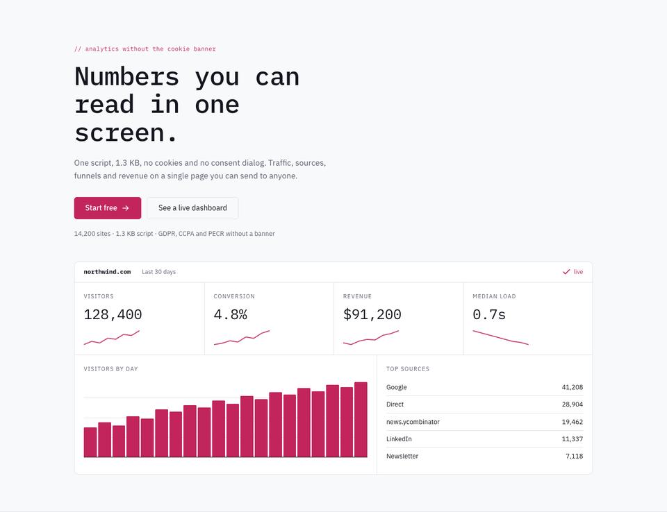
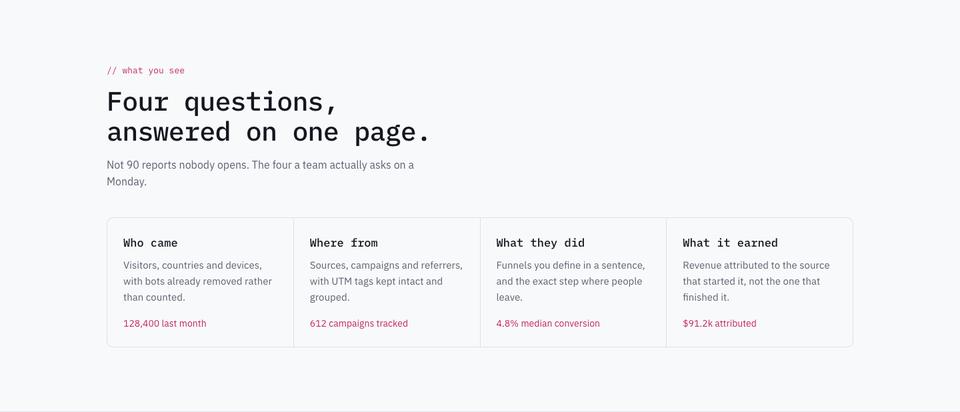
The hero promises “Numbers you can read in one screen” and backs it with facts about the script, cookies and consent, beside a drawn dashboard. What you see reduces the product to the four questions a team actually asks each week.
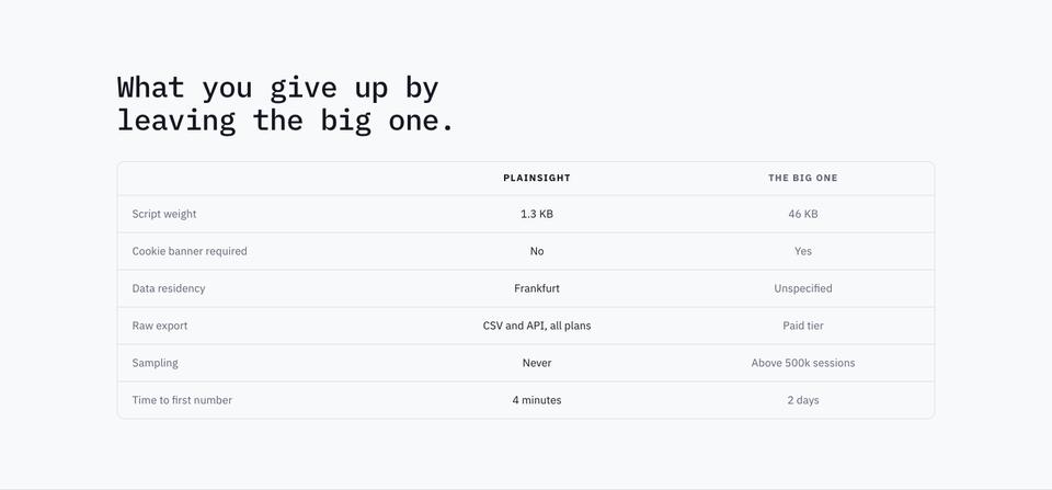
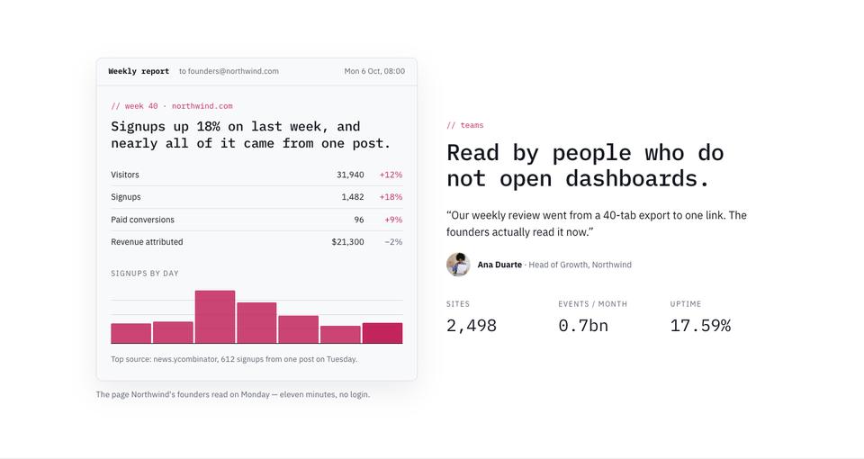
How it works shows the one-line integration and what happens after deployment. The comparison is a straight table against the incumbent on script weight, consent, data residency and export. The weekly report shows the email summary sent to founders who never open dashboards, a clever proof that the product fits real behaviour.
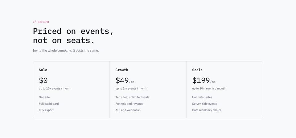
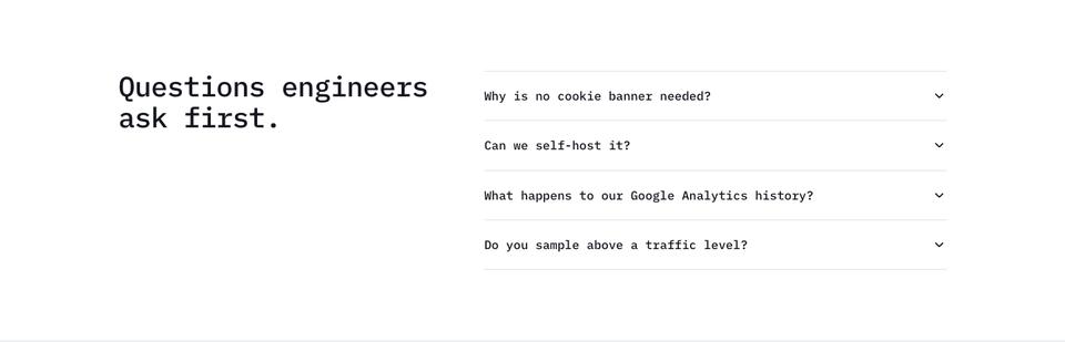
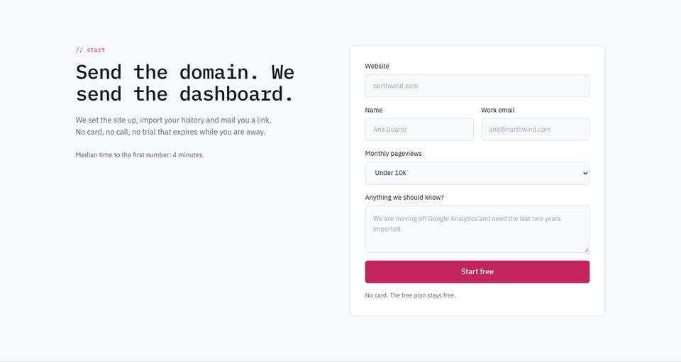
Pricing charges on events rather than seats, with a free tier. Questions answers what engineers ask first, such as why no cookie banner is needed, and the page ends with start: send the domain and receive a dashboard with history imported.
Adjusting the look
Four schemes are included: Raspberry, Cobalt, Teal and Ink. Type pairings are IBM Plex Mono over IBM Plex Sans, JetBrains Mono over Barlow, or Space Grotesk over Mulish for a softer read. There is only one photograph in the demo; the charts are the imagery.
Chart labels, table rows and pricing tiers are editable. Select the comparison table and ask the AI to rebuild it from your own feature list.
Writing it for your product
Starting from the template costs no credits. For about 20 credits, the AI replaces the sample copy with text for your product while keeping the layout. Give it the questions your product answers, the integration step, the facts you can compare, what reports you send, pricing and what happens on sign-up.
Getting real numbers onto the panels
This page shows the product as working panels, so the figures inside them need to be believable. Use a realistic sample dataset, with units on every value and a date range, and make sure the chart matches the stat tiles above it. If your product has a public demo account, draw the panels from it so visitors who sign up see the same thing.
The comparison table is where buyers decide, so choose rows that matter to them, such as script weight, cookies and consent, data residency, export options and price at a given volume, and check every value about the competing product against its current documentation. Write the integration section as the exact steps a developer follows, with the time it takes. Pricing should name the metered unit clearly, whether events, rows, hosts or queries, and state what happens when a limit is passed. One photograph is used, so the page loads almost instantly, which suits a product sold on speed.
Observability, BI and data platforms
An observability product can replace traffic panels with latency, error rate and saturation charts, and compare on data retention and pricing per host. BI and reporting tools usually show a dashboard built from a connected warehouse, with a section on which data sources are supported. Developer APIs and data platforms can use the panels for request volumes and response times, and turn the comparison into limits and rates per plan.
When another template fits better
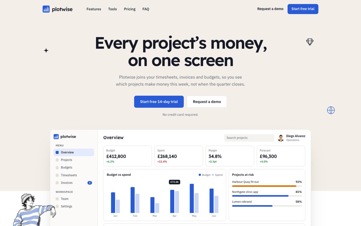
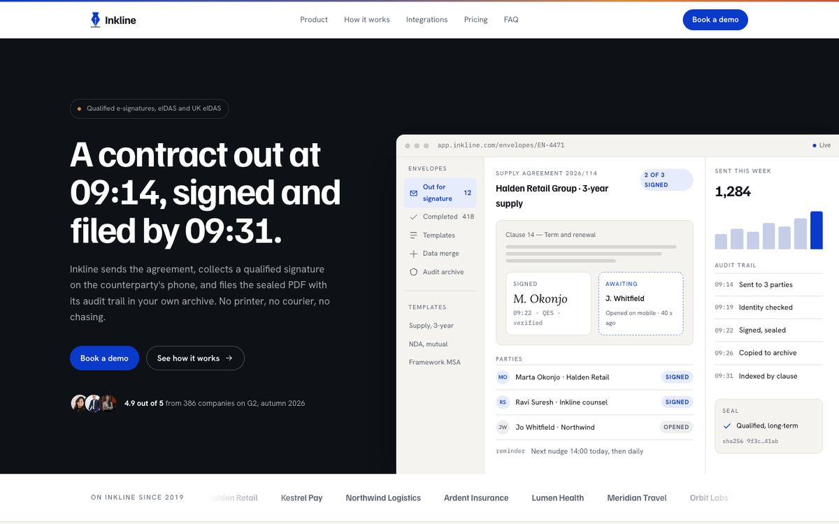
Data Panel is light and numerical. A tool sold to engineers in a darker, quieter style fits Developer Tool, and a finance dashboard for operators and project owners belongs on Project Finance Dashboard. A privacy or compliance platform may prefer Data Privacy Platform, and a marketing analytics tool for small businesses fits Marketing Tool SaaS.
See every software layout on the SaaS and software templates page.
Before you publish
- Replace the drawn panels with your product's real views.
- Check comparison facts are accurate on the day you publish.
- Confirm event limits and pricing match your billing.
- Keep sign-up to the domain and an email address.