For crypto products that lead with safety
Crypto buyers have seen every kind of landing page promise. What persuades them now is precision: exact fees, specific protections and a product that looks live. Web3 is a near-black template with shared-hairline grids and a hero that catches the product at the moment it blocks a bad signature.
It is written for a self-custody wallet in private beta, and works for exchanges, trading apps, DeFi tools, fintech waitlists and security-focused developer products. Choose it when your audience is traders or builders and the page should feel dark, exact and current.
How the page sells, section by section
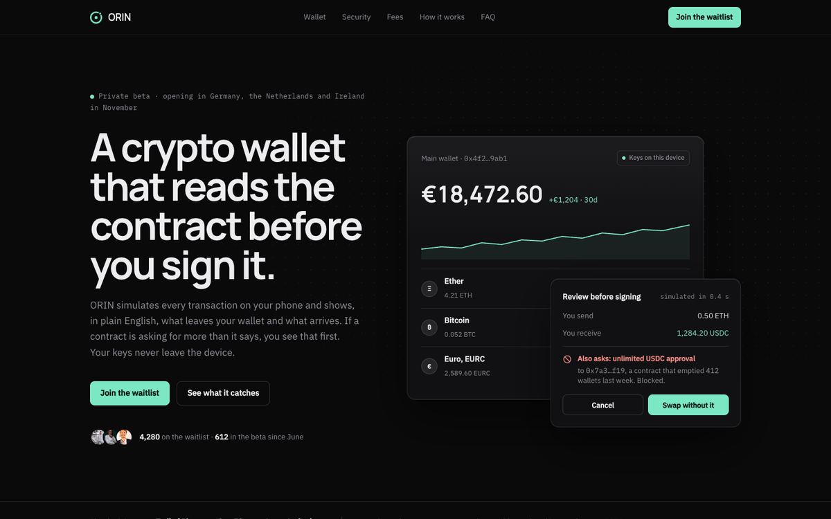
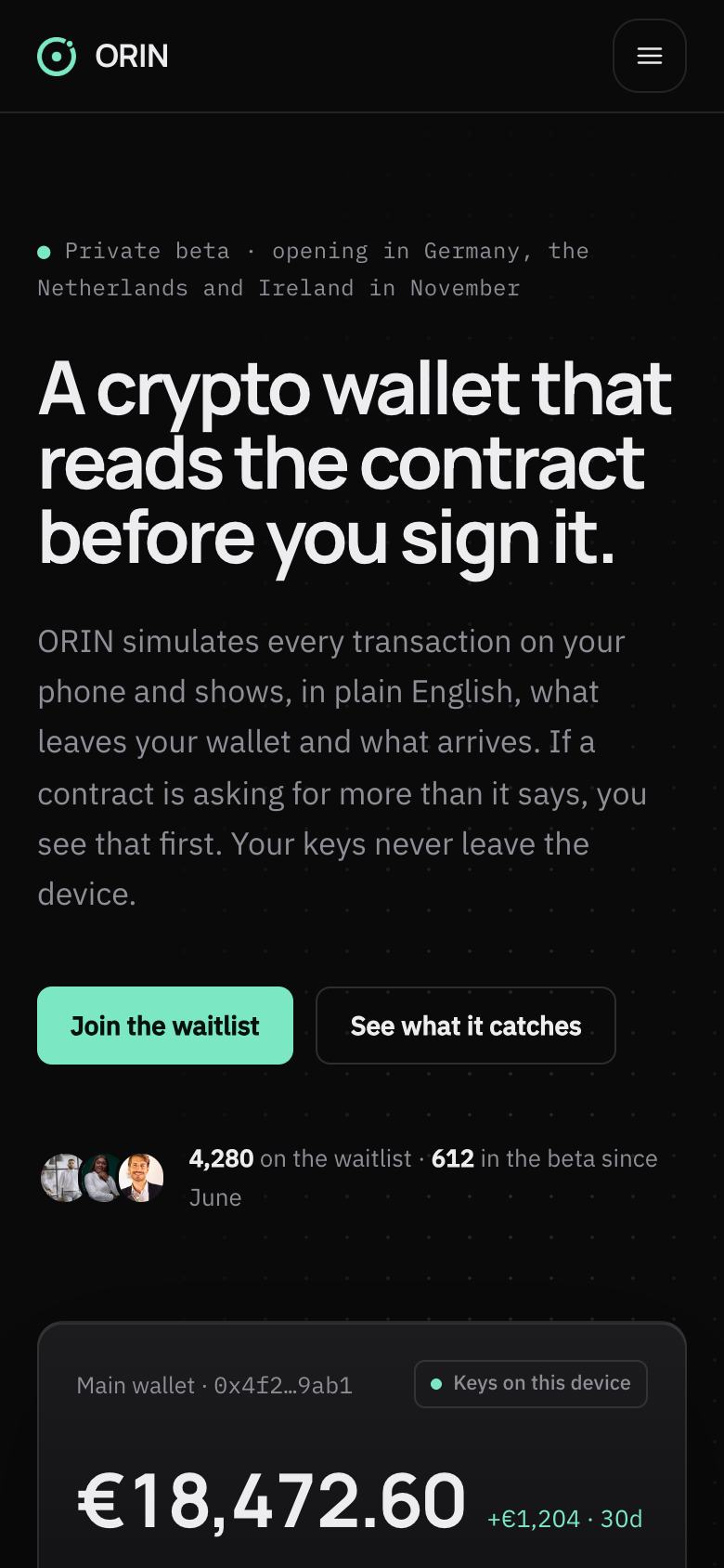
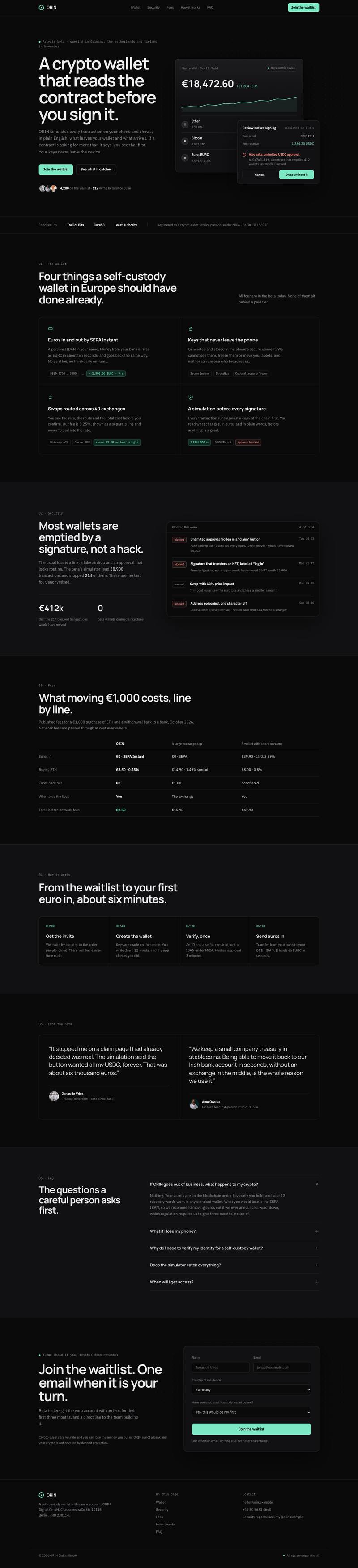
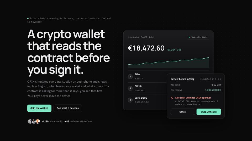
The hero states the protection in one line, “A crypto wallet that reads the contract before you sign it”, above an interface card showing a warning. A small status line about where and when the beta opens makes the waitlist feel real.
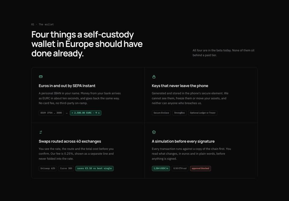
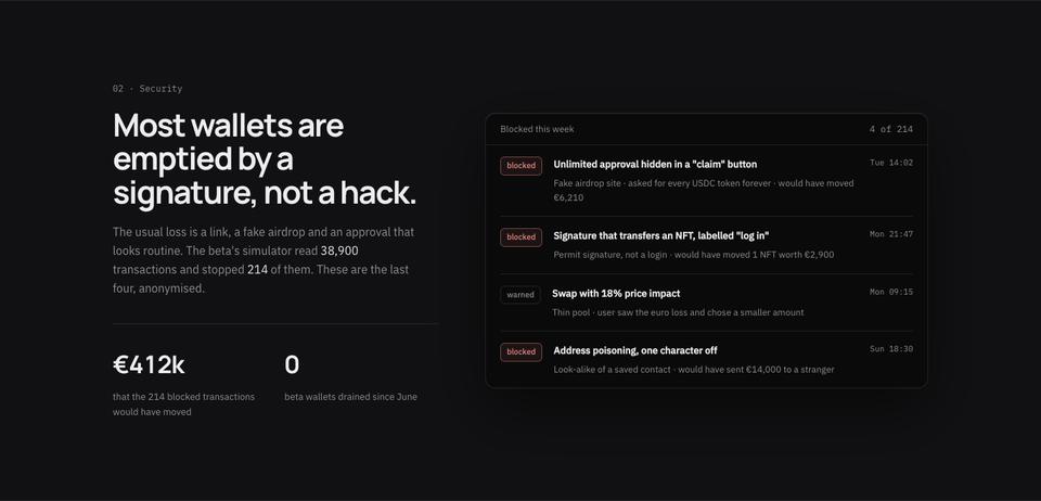
The wallet lists four capabilities in a hairline grid and says none of them sit behind a paid tier. Security explains the common way people lose funds, a routine-looking approval, and how the product intervenes, which is more convincing than a list of certifications.
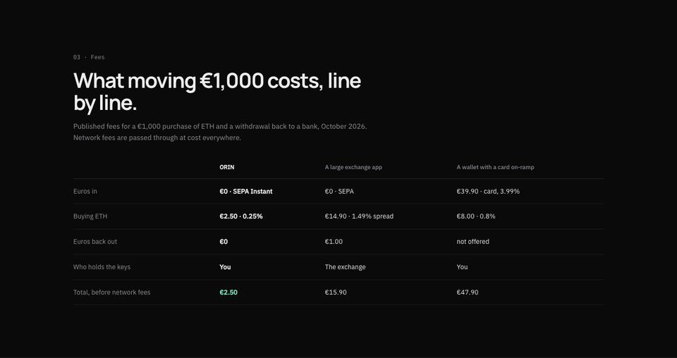
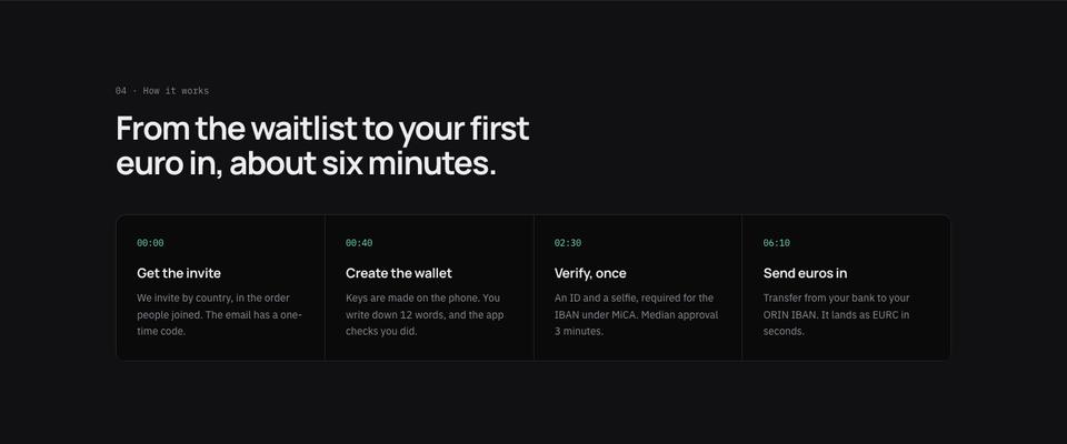
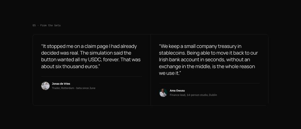
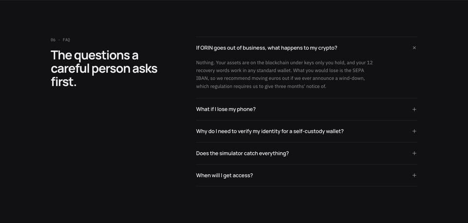
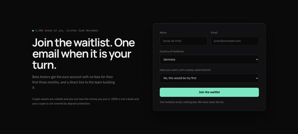
Fees breaks down what a €1,000 purchase and withdrawal cost, line by line. How it works times the path from invite to first deposit. A beta tester quote recounts a specific save, questions answers what a careful person asks first, such as what happens if the company fails, and the page closes on a waitlist form with the queue ahead of you.
Making it yours
The four schemes, Mint, Mono, Amber and Coral, change the single accent that marks warnings, numbers and buttons. Headings can be Manrope, Hanken Grotesk or Lexend, over IBM Plex Sans or Hanken Grotesk body text; the mono-flavoured numbers stay legible in each.
Edit the fee table directly in the editor, or select it and ask the AI to update the figures from your own schedule. Sections from the library, such as a supported-assets grid or a team band, inherit the dark tokens.
Writing the brief
Start from the template at no credit cost, or have the AI write the text for your product for about 20 credits while the design stays as it is. Give it the countries you serve, the one protection or feature you lead with, your fee schedule, the steps from sign-up to first transaction and the answer to “what if you go under?”
Material to prepare first
Crypto visitors read the small print before the headline, so gather it before you edit. The fees section needs a real worked example: a set amount in, the spread or commission, the network fee and what arrives at the other end, dated so readers know when it was true. The security section needs one incident type you protect against and how the product handles it, written without claiming that nothing can ever go wrong.
Check the wording of any statement about custody, licensing or the countries you serve with whoever handles your compliance. The questions section should answer what happens to funds if the company stops trading, what data you collect at sign-up, and how support can and cannot help with a lost recovery phrase. Those three answers remove the doubts that most often stop a careful person joining a waitlist.
Adapting it for exchanges, trading and developer tools
An exchange can keep the dark grid and replace the wallet features with order types, supported assets and withdrawal times. A trading app benefits from a live-looking numbers band, such as average execution time or the assets listed, placed right after the hero. For a security-first developer tool, the simulator story becomes an example of a bad deploy or a leaked key being caught, and the waitlist form can ask for a GitHub handle instead of a country. In each version, keep one number in the hero that a sceptical reader can verify.
When another template fits better
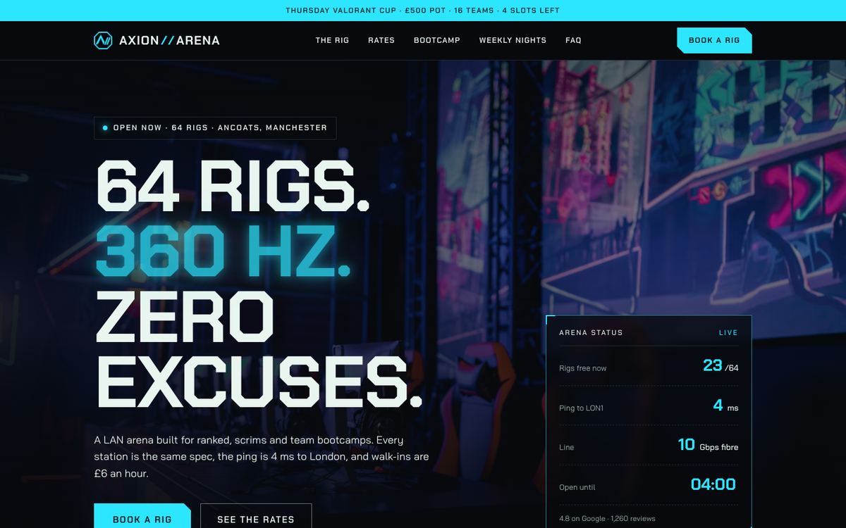
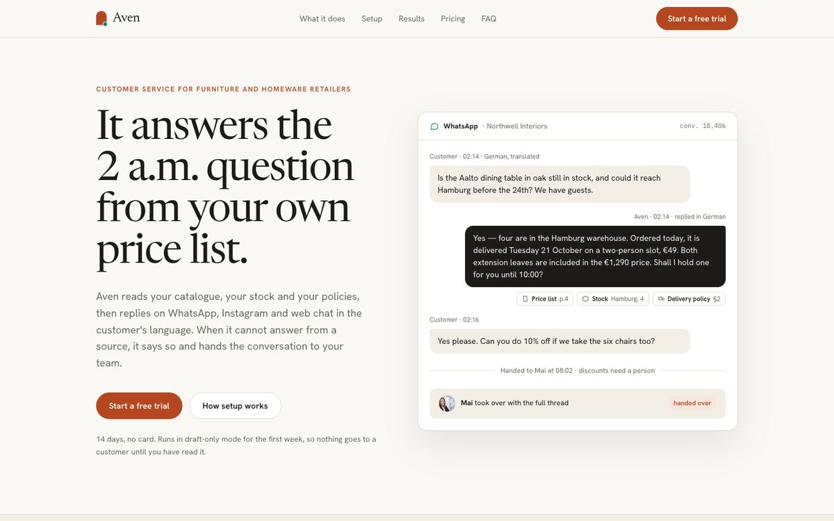
Web3 is deliberately dark and sparse. If your crypto or fintech product targets a mainstream audience that expects a friendly, light page, SaaS Conversion or the payments-focused Lime Ledger will feel more familiar. A bank, accountancy or insurer usually needs the calmer serif register of Quiet Ledger. And if the audience is gamers rather than traders, Gaming keeps the dark ground but trades precision for energy.
There is also a short list of finance and fintech templates if the product is closer to banking than to web3.
Before you publish
- Have the fee table and any regulatory wording checked; it is the section people screenshot.
- Replace the interface cards with your own product states.
- Only show a queue count if it updates or is clearly dated.
- Connect the waitlist form to your email tool or webhook so invites can go out in order.