For apps that live or die on the install
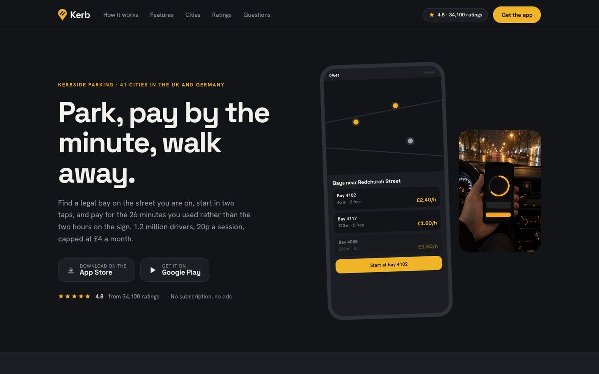
An app landing page has one job: send people to the store convinced. They need to see the app, believe it works where they are, know what it costs and trust what it does with their phone. Mobile App Install is a graphite template with device frames drawn in CSS and app store badges, and it keeps the product in view throughout.
It suits navigation and transport, parking and charging, banking and budgeting, fitness and habit tracking, and delivery or booking apps. Choose it when the page must show the product and the conversion is the install.
How the page drives installs
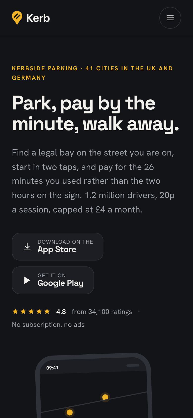
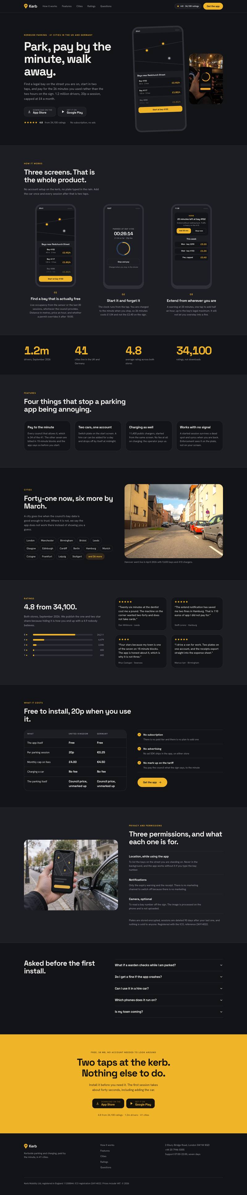
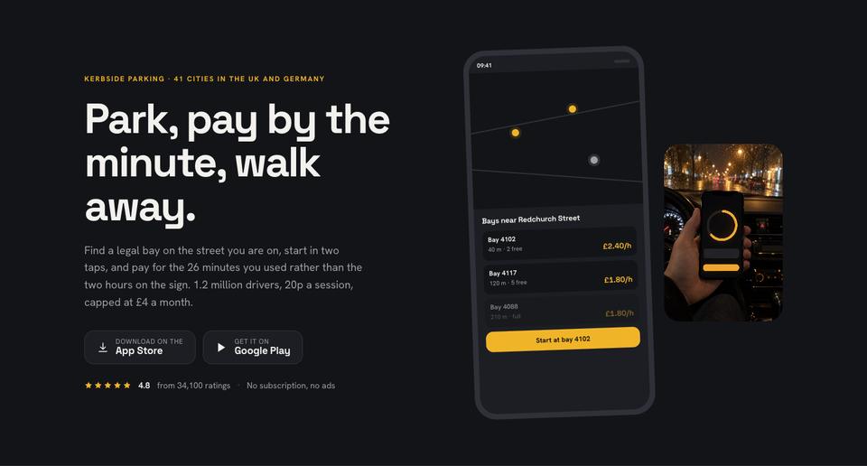
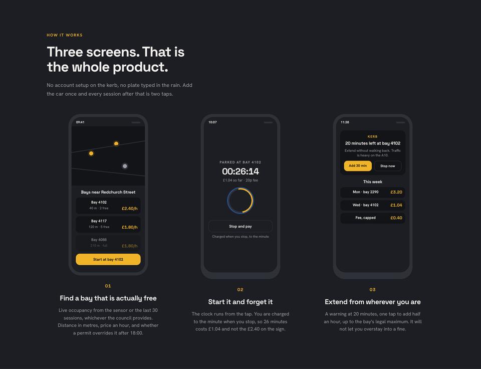
The hero describes the whole use in one line, “Park, pay by the minute, walk away”, with where the app works and a device showing it. How it works reduces the product to three screens, the strongest possible argument that it is simple.
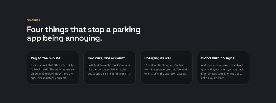
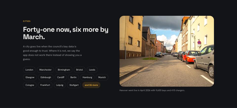
A numbers band gives users, cities live, rating and number of ratings. Features lists four things that remove the usual annoyances. Where it works lists cities and what is coming, and is honest about where it does not.
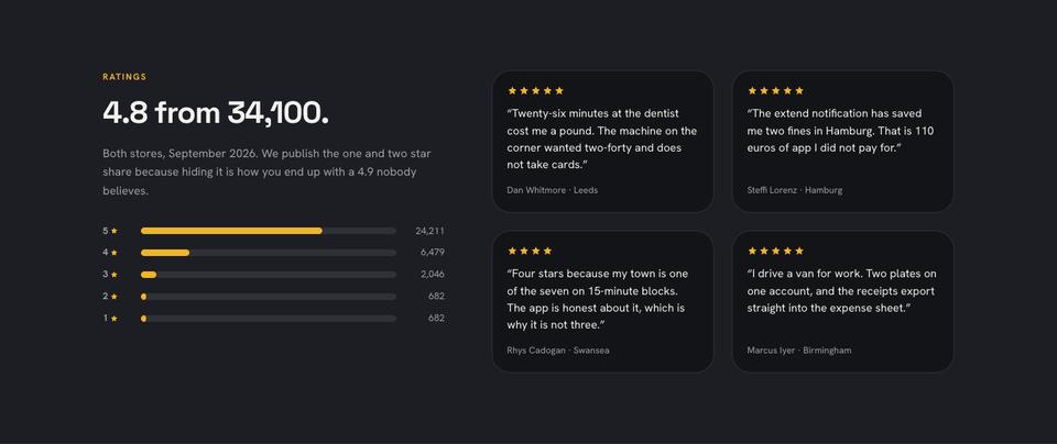
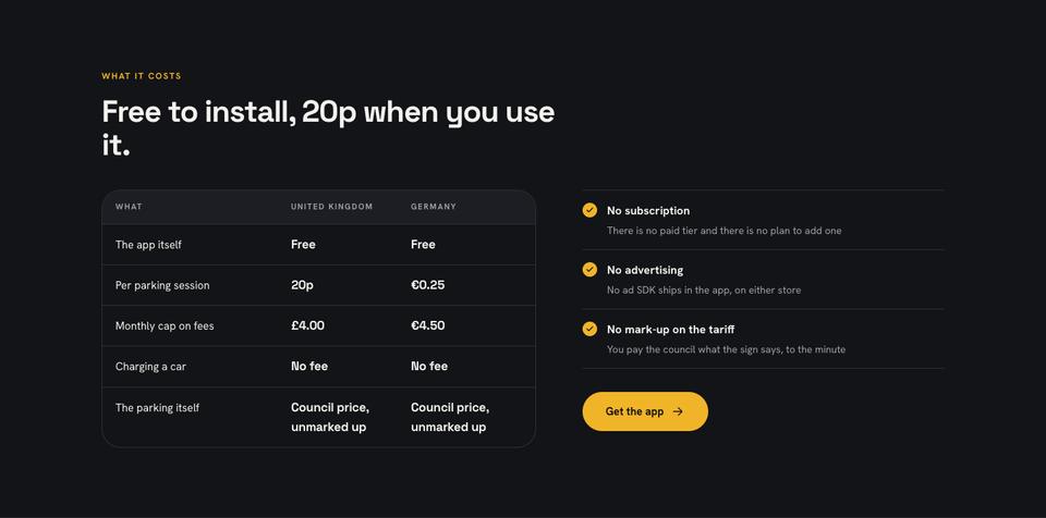
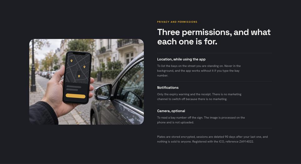
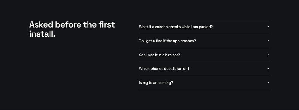
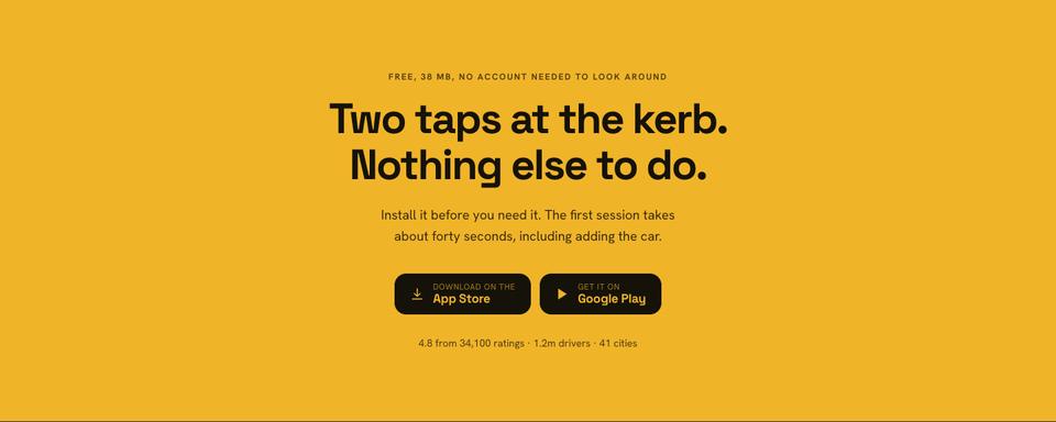
Ratings publishes the full distribution, including one- and two-star shares. What it costs is a table of fees by country with caps, privacy and permissions explains each permission requested, questions answers practical worries, and get the app closes with store badges and download size.
Adjusting the look
Four schemes are included: Amber, Cobalt, Mint and Coral. Headings can be Space Grotesk, Plus Jakarta Sans or Archivo. Only one photograph is used; the device frames with your screenshots carry the page.
Drop your screenshots into the device frames, and edit the fee and city lists in place. Select any section and ask the AI to rewrite it for your app category.
Writing it for your app
Starting from the template is free. For about 20 credits, the AI writes your copy into the layout. Include what the app does, the three key screens, where it works, users and ratings, features, pricing or fees, permissions and why, and the store links.
Screens, ratings and permissions to prepare
This template draws the phone frames in code and fills them with real screens, so export clean screenshots of the three steps a new user takes, from opening the app to finishing the core task. Use realistic data and remove anything personal. The walkthrough copy should describe what the user does on each screen in one sentence.
The ratings section publishes the average score with the true number of ratings from both stores and the date, and it can show the share of low ratings too, which makes the average more believable. The coverage section needs the cities, regions or providers the app works with today, and when more are planned. Write down every permission the app asks for, such as location, notifications or camera, and why each one is needed, since that is a common reason people hesitate. The pricing table should state what is free, what is charged per use and any caps, for each country. Store badges must link to the correct listings for each platform.
Banking, fitness, delivery and booking apps
A banking or budgeting app can replace coverage with supported banks and add a section on security and deposit protection. Fitness and habit apps usually show a week of progress screens and subscription pricing with a free trial. Delivery apps can turn cities into delivery zones and times. Booking apps can show availability search, the confirmation screen and the cancellation policy, keeping store badges as the only action.
When another template fits better
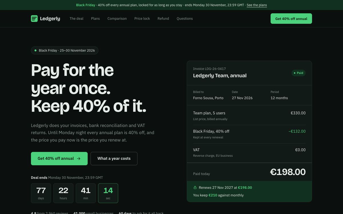
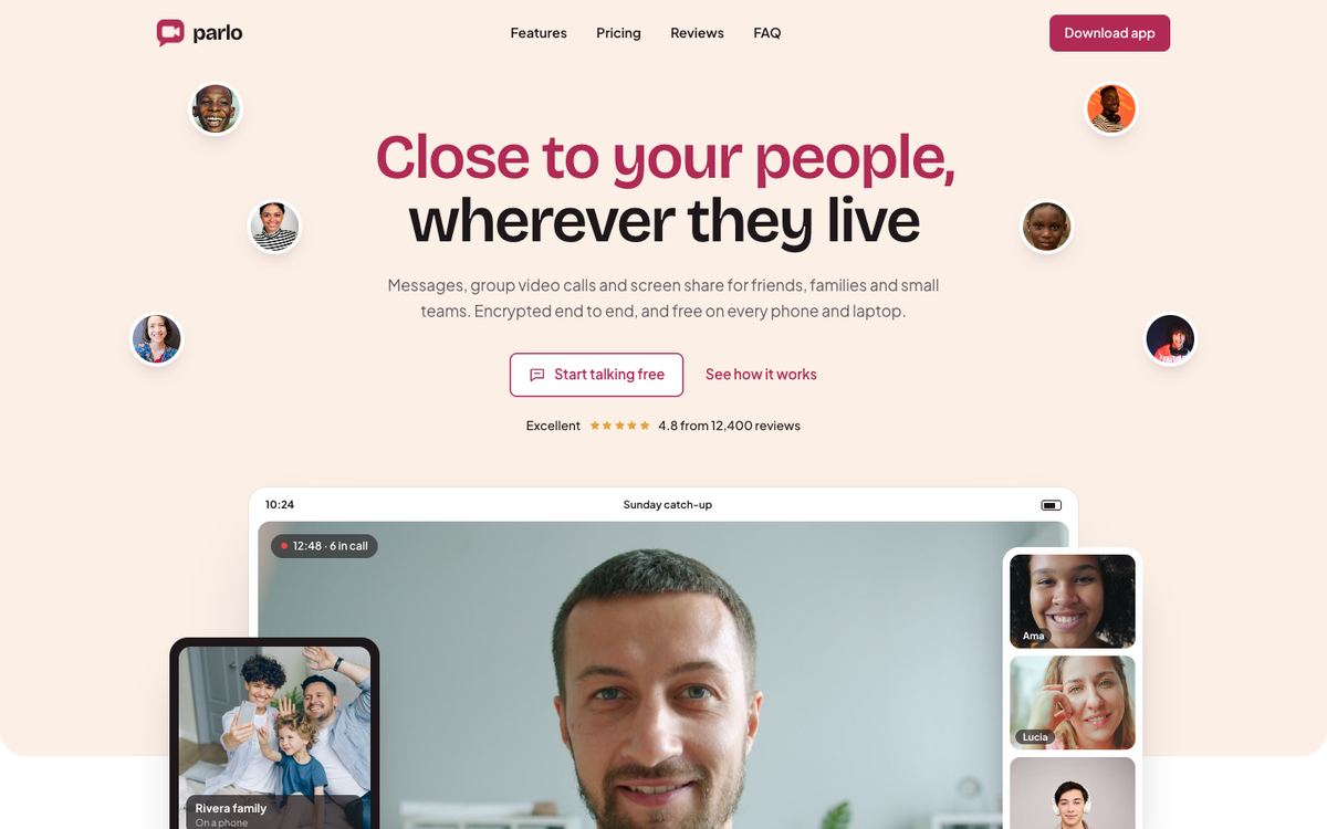
Mobile App Install targets consumers and installs. A video calling or messaging app with plans fits Video Chat App, and a B2B product sold on demos belongs on SaaS Conversion. An app studio selling development work should use Frosted Glass, and a spend-management app for finance teams Lime Ledger.
See every layout on the ecommerce and product templates page.
Before you publish
- Use current screenshots that match the store listing.
- Check ratings figures and date them.
- Make the permissions section match what the app actually requests.
- Link badges to the correct store pages and track install clicks.