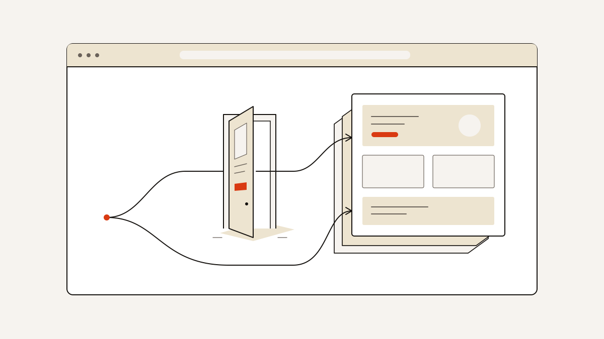
If you want an enquiry from an ad, send visitors straight to a landing page focused on that goal. A splash page is an extra screen before a website’s main content. It usually presents a notice, choice or short offer.
Add that screen only if visitors need to make a choice or complete an access check before reaching the content.
What visitors do on a splash page
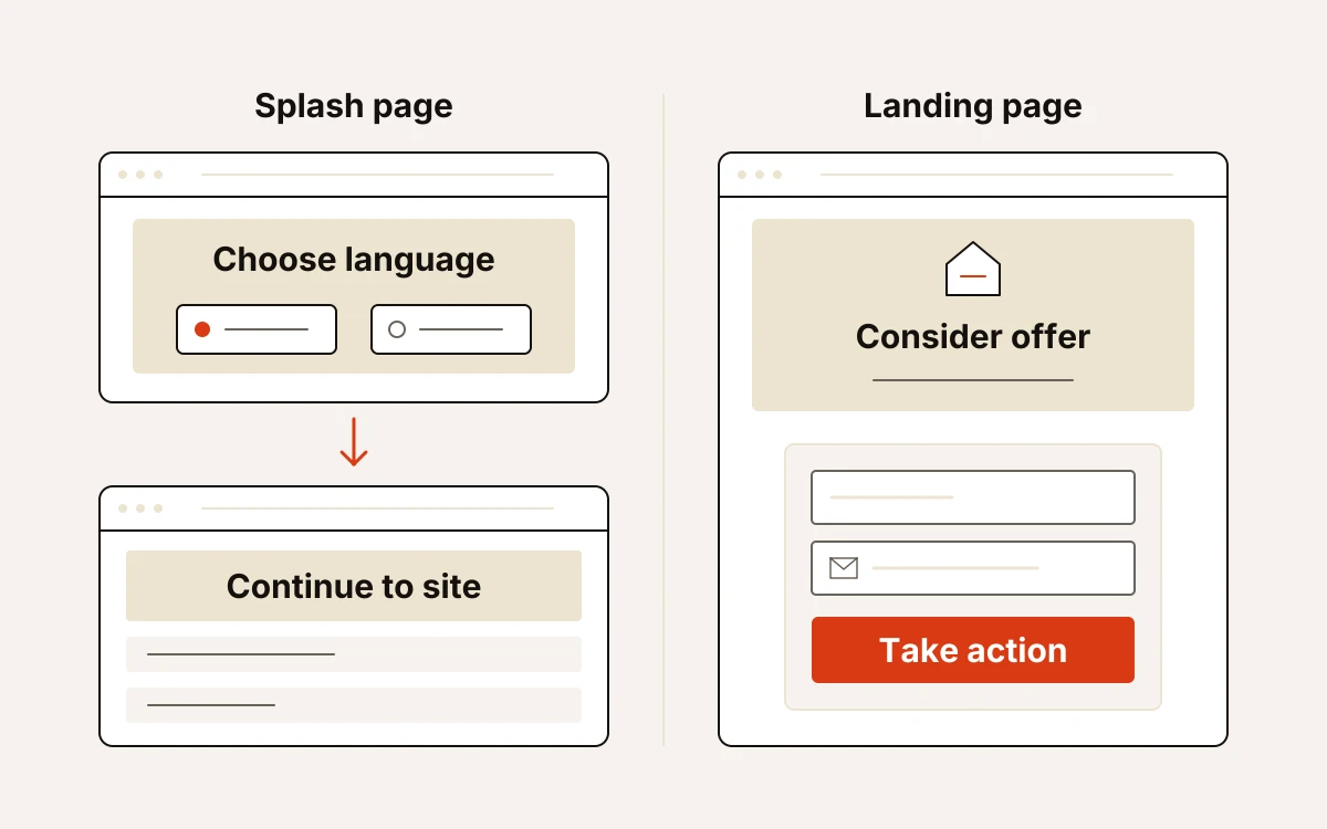
- Splash page: pass through to the site. Visitors might choose a language or country before continuing. They might also read an urgent notice about an approaching deadline.
- Landing page: consider a specific offer and act on it. The text helps visitors decide whether to make an enquiry or place an order. Links to other pages are often removed to keep attention on that action.
- Homepage: explore. Visitors can find your services, learn about your business and choose which content to read.
An optional discount signup belongs in the first category only if visitors can decline it and continue. Both choices need clear wording. Give the signup button a plain label. For the route to the main content, use wording such as “Continue to the site”. Visitors can then see that they can skip the offer and still enter the site.
Asking for an email address before showing useful content forces an early choice. Visitors must decide before they can judge your offer. They must either share their details or find a way past the request. If the discount needs product information to make sense, show that information before asking for the signup.
Only add an extra screen when it earns its place
Keep a splash screen only when it meets a distinct visitor need. If it has a useful purpose but leaves visitors hunting for the next step, simplify it.
- Keep a necessary choice or access check. A language choice can direct visitors to content they can read. A required age gate controls access to restricted content and must stay separate from an optional promotion. A date-of-birth prompt alone is not proof of legal compliance.
- If the screen repeats a promotion already visible at the destination, remove it.
- Explain the exchange before showing the form: what the visitor receives and what they are signing up for. If an email address is enough to deliver the offer, ask for that alone. Extra fields delay the return to shopping or reading.
- Make actions visible with brief copy and clearly labelled buttons or links. Visitors should not need to move a mouse over an image to discover what is clickable or how to continue.
- Keep visuals lightweight. A clear image should support the message; visitors should not have to wait for animation to enter. Video or animation can delay loading or fail to appear with an ad blocker enabled, so the message and route forward must work without them.
Check the journey from arrival to recorded lead
Test the full route from the visitor’s arrival link to the enquiry recorded in your inbox. Include the first screen, the buttons and what happens after you send the form.
- Load the page on your phone using the link visitors will receive. The message and buttons should appear promptly. You should be able to read the text and use the form without zooming.
- Follow each route through the page, including the main action. If there is an optional signup, try the route that skips it too. Each button should reach the expected content without opening a surprise tab or an unannounced full-screen window.
- Complete the enquiry yourself, including any consent choice, then check the confirmation and inbox. The confirmation should make sense. A thank-you message alone does not confirm that the enquiry arrived.
- Check where the lead came from using a campaign-tagged link: a link labelled with its campaign. Compare those details with the recorded source (where the visitor came from) and campaign. This tells you whether you can connect the enquiry to the campaign that sent it.
At landflow, we build pages that collect leads with exactly one goal and one form. When someone submits the form, we record the source and campaign on the server, the computer handling the enquiry. Our six-check publishing gate, the checks before a page goes live, includes checking the phone layout. It also confirms that the enquiry is saved in the inbox before any tracking pixel runs. A pixel is code that records a visitor’s activity.