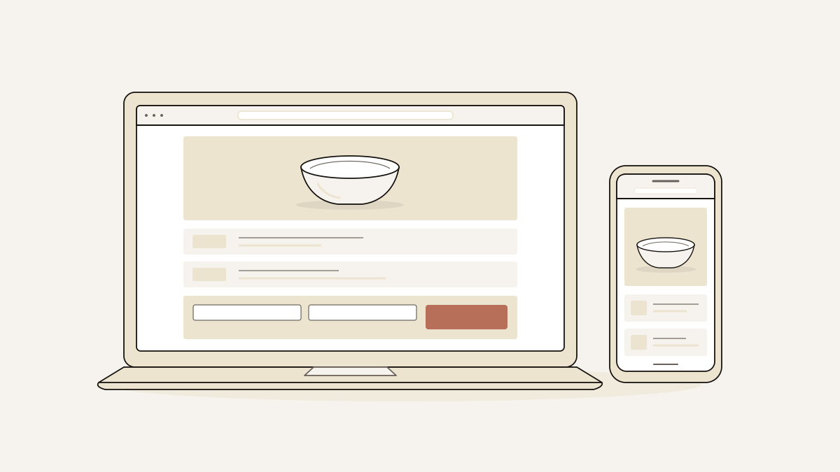
Good ecommerce page design makes the product, offer and next step obvious. If your campaign page collects leads, show what you sell and answer the buyer’s concerns, then direct visitors to one form. Leave catalogue browsing and checkout to your shop: an enquiry or order form cannot replace a complete shop checkout.
Organise the page around one offer and one conversion goal. The layout should fit your product, and the page needs checking on mobile. Before publishing, submit a real enquiry and confirm it reaches your inbox.
Give visitors one offer and one clear next step
Product details answer the questions that stop visitors from making an enquiry. The form gives interested visitors a way to act. Arrange the sections in the order a buyer is likely to ask those questions.
- Offer: Say what is available and what sending the form starts. That could be an enquiry, a pre-order request or a conversation about the product.
- Product detail: Give buyers enough detail to decide whether the product suits them. This might include its size, materials, what it works with or what the bundle contains.
- Reassurance: Explain the terms that apply, what is available and what happens after someone sends the form. Put each answer beside the detail that raises the concern.
- Form: Ask for the information you need to handle the request. The button should name the action, such as “Send enquiry”, rather than “Submit”.
Keep the same promise from the offer through to the form. If visitors are asking about availability, the button and confirmation should say so. Wording that suggests they have completed a purchase promises something else.
In landflow, we give each page exactly one conversion goal: the action you want visitors to take. Each page also has exactly one lead form, which collects their details. The product is built to collect leads.
If buyers need to compare a catalogue, combine items in a basket or pay, send them to your shop. Those steps belong there. Keep this page focused on the request you can receive and fulfil.
Choose the layout around your product and buyer’s doubts
Choose a layout you have enough product photographs to fill. It also needs space to answer buyers’ questions before they submit the form. Colour and fonts should suit the product, and sections should follow the order of buyers’ questions.
- If appearance is part of the offer, give product photographs priority. Colours and fonts that match the packaging and photographs help the offer feel consistent. Keep decoration clear of the product details so buyers can inspect them.
- If buyers need an explanation before they can enquire, put it beside the relevant image. Explain what is included, which option the offer covers or how to use the product. The image and text should answer the same question together.
- If delivery or suitability could hold up a request, make shipping, returns and contact details easy to find. Put this information near the offer or form, and label the policy text clearly. Buyers should not have to submit an enquiry just to discover your delivery terms.
- If the page needs several sections, repeat the same action after useful details. Each button should lead to the same form and describe the same request. Leave catalogue search in the shop. It gives buyers an unnecessary browsing task on a page for a single offer.
- If you are choosing a template, compare what it needs with the material you have. Every landflow template page states its section count, photograph count and colour schemes. It also states whether the form collects enquiries or orders. Start with a photograph count you can fill and sections you have content for. The form must suit the request you want buyers to make. Browse the 77 ecommerce landing page templates for product launches, sales, bundles and pre-orders. A preferred colour scheme comes after those decisions.
Check the mobile page and submit a real enquiry
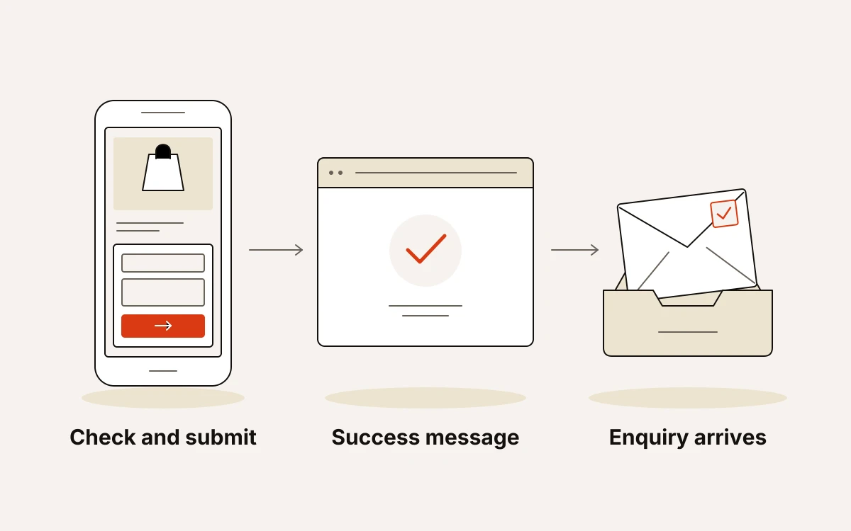
Before sending campaign traffic, check the page on a phone and follow a real submission through to your inbox. The check is complete when the enquiry arrives, with a success message on the page along the way.
- Look for clipped product details, unreadable text and form fields that are awkward to tap on a phone. With the keyboard open, the submit button should still be within reach.
- Tap each offer button and in-page link to confirm that it reaches the intended section. Contact and policy links should also open correctly.
- Check that images load, are licensed and are hosted on your domain. Before sharing the campaign URL, check the page title, description and share image too.
- Submit a real enquiry through the URL you intend to use in the campaign. Then find it in your inbox and check its contents, comparing the recorded campaign details with that visit.
Our six-check gate verifies the single form, working anchors, licensed and domain-hosted images, inspected phone layout, title/description/share image and inbox writing before any pixel fires. At submission, we stamp source, medium, campaign, click id, landing URL and consent state on the server.
For publishing, landflow can put the page into your Shopify store’s theme through its Shopify app, or onto your WordPress site through the Connector plugin. You approve the WordPress pairing in your own wp-admin.
Repeat the submission check on the published URL before switching on the ads.