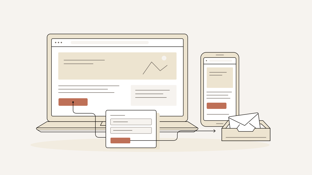
A web page banner should make your offer clear immediately and give visitors one obvious route to leave their details. On a lead-collecting landing page, we recommend a short headline, a useful image and a clear call to action. Choose dimensions that fit your page layout rather than a display-ad size.
Keep the message readable on desktop and mobile, and connect the banner to one lead form. When you check the page, confirm that an enquiry is recorded with its campaign details. A click count alone does not tell you whether the enquiry was recorded.
Web page banner: how it works before the form
The banner gives visitors a reason to continue to the form and start an enquiry. A page banner is part of the page they have reached; a display advertisement asks them to visit it. Each has a different job, even when both promote the same offer.
Visitors need to understand what you offer, why it is useful to them and what happens next. Keep the headline, supporting image and call to action focused on the same promise:
- Headline: name the offer and its main benefit. Add a concise description if visitors need more detail to understand it.
- Supporting image: show the product or service being offered. Keep it consistent with the message.
- Call to action: describe the action visitors will take. If the form requests a quote, use “Request a quote”, not “Buy now”.
Decide what visitors will do before writing the button label. If they are making an enquiry rather than placing an order, set that expectation in the banner, before they reach the form.
We build each landflow page around exactly one conversion goal and exactly one lead form. The banner therefore points to a specific destination: the form that fulfils its promise. Visitors have no unrelated routes to choose between.
Design rules for dimensions, images and the call to action
Let the content set the banner’s height. The layout needs room for readable text and a visible action on desktop and mobile, without squeezing either into a fixed rectangle.
- If the banner feels cramped, change the layout before shrinking the text. Allow space around the headline and button, and remove decorative details that compete with them. White space helps visitors distinguish the offer from its surroundings.
- When text and an image sit side by side on desktop, check how they stack on mobile. Read the headline at the narrow width, inspect its line breaks and make sure a fixed-height container does not clip the button. Check mobile usability separately from desktop proportions.
- Check what survives at each screen size when an image is cropped to fill the banner. Keep the detail that explains the offer in view. If the crop removes the product or the result you want to show, change the crop or give the image its own space.
- If an image only decorates the page, replace it with something informative or leave it out. A product in use or a visible result can explain more than an isolated product photograph. Choose an image that tells the visitor something; filling space is no reason to include it.
- Keep the surrounding background plain if a photograph contains people or a colourful product. Avoid placing copy over busy details. A solid-colour text area keeps the words readable without asking the visitor to search for them.
- If the message depends on a clever phrase or subtle visual cue, make it explicit. Keep the colour palette restrained, then give the CTA enough contrast to stand apart. A brighter button helps distinguish the action, provided every other element is not equally bright.
A pre-publish checklist from banner to recorded lead
Test the whole route before publishing, through to the enquiry arriving in the inbox. Treat each check as pass or fail, and fix failures before sending traffic.
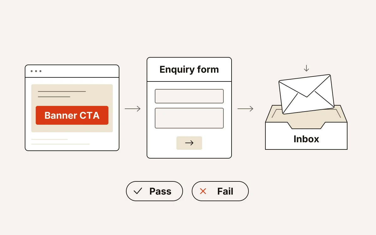
- Follow the banner CTA. Pass if it reaches the promised enquiry form and the form asks for details relevant to that promise; fail if it leads elsewhere or changes the offer.
- Open the page on a phone. Pass if you can read the offer, reach the CTA and complete the form without clipped text or obstructed fields.
- Submit a test enquiry from a campaign-tagged URL. Pass if the enquiry appears in the inbox with the expected campaign details; fail if you see only a success message or a pixel event.
- Compare the record with the visit. Pass if the recorded attribution matches the campaign link you used and the consent choice you made.
Our six-check quality gate requires exactly one lead form, every in-page anchor resolving, images licensed and hosted on your domain, the phone layout rendered and visually checked, a title, description and share image present, and the lead written to the inbox before any pixel fires.
At submission, we stamp source, medium, campaign, click id and landing URL on the server, together with the consent state. That gives you an enquiry record to check without having to infer it from a click.