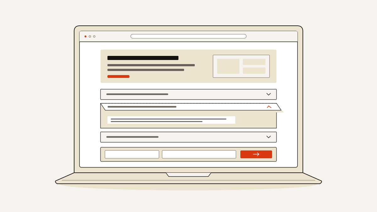
Use an FAQ accordion when visitors need to scan several optional answers before leaving their details. Essential offer information should stay visible. If you have only a few short answers, show them directly so visitors can read them without opening each one.
Decide what needs to stay visible first, then which remaining questions belong in the FAQ. Each question needs to work without a mouse. Before publishing, use a checklist to check both the FAQ and the path to your lead form.
What visitors need before they open a question
Visitors need enough information to judge your offer before they open an FAQ answer. The main page text should explain what you provide and who it is for. It should also say what someone commits to when they submit the form.
An FAQ accordion is a list of frequently asked questions with answers hidden underneath. Selecting a question shows its answer. Selecting the open question again hides it. On a page with lots of content, this lets you scan the questions. You can then read only the answers you need. Each answer takes another action: visitors must find the right question and open it.
If a condition could change someone’s decision to enquire, put it beside the offer or form. Hiding it in a closed answer adds a step before visitors can decide.
The FAQ’s job is to clear up remaining doubts before someone submits the form. Keep one conversion goal (the action you want visitors to take) and one form to collect leads. Answers can reassure someone about getting started or how long things will take. Visitors can then submit the same form, with no need for a separate sign-up or contact route.
Which questions deserve a place
Each question should answer a doubt that could stop someone making an enquiry. The doubts still left to answer decide how many frequently asked questions (FAQs) you need.
- Include getting-started questions when the next steps need explaining. “How can I get started?” gives you space to explain what happens after an enquiry. You can also say what information someone should prepare. Describe the steps they will take, rather than asking them to contact you again.
- Include timeline questions when people need to understand the process. “What does your timeline look like?” can explain the stages and what affects their timing. If a promised time decides whether the offer suits someone, put it in the main text.
- Group questions only when separate topics become hard to scan. Groups help visitors find the answers they need in a longer list. For a short list, headings add another layer to read.
There is no set number of questions that suits every page. Stop adding questions once you have answered the remaining doubts. Remove any whose answers just repeat the page.
Make every question usable without a mouse
Each question needs a button that works with a keyboard. It must tell assistive technology, such as screen readers, whether the answer is open. A clickable heading alone does not do this.
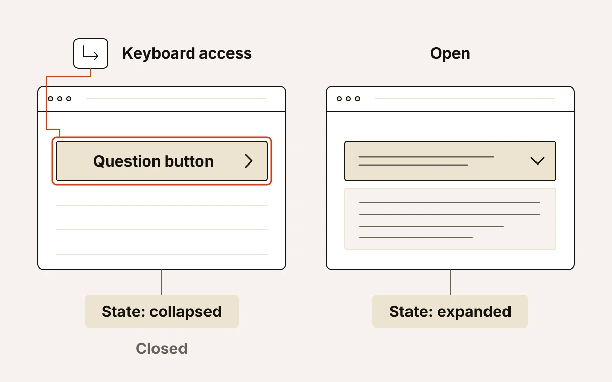
Whoever builds the FAQ needs to meet these requirements:
- Use a button for each question, with the full question text inside it. Tab should reach each question. Enter or Space should open and close its answer.
- Keyboard focus, the marker showing which question will respond, must be visible. Use a clear outline or similar highlight. It needs enough contrast against the button’s background colour to stand out.
- Each button should report whether its answer is open or closed and identify that answer. Screen readers, which read page content aloud, can then tell users whether the answer is open. They can also say which question it belongs to.
- Pair icons that signal an answer can open or close with text. A plus, minus or chevron (an angled arrow) can support the question label. It should not replace it. Decorative icons should not add distracting screen-reader announcements.
- Opening or closing an answer should leave keyboard focus on its question button. This keeps keyboard users in the same place. When an answer is closed, Tab must not reach any hidden links or controls inside it.
Give these requirements to your developer, or check that your chosen FAQ component meets them. You cannot judge this from its appearance.
Check the FAQ and enquiry path before publishing
Test the published page from the questions through to the lead form, where visitors send enquiries. Visitors will use this page, so it needs testing beyond the editor preview.
- Read the questions with every answer closed. Each should ask something clear and distinct. Rewrite vague labels and merge questions that ask the same thing.
- Use the keyboard and a screen reader, which reads page content aloud. Press Tab to move through the question buttons. The selected button should be clearly marked, and Enter and Space should open and close answers. The screen reader should say each question’s name and whether its answer is open or closed.
- Open answers on your phone. Text should stay readable without sideways scrolling. Open answers should leave the form uncovered and easy to reach.
- Follow the steps to send an enquiry. The page should have one conversion goal, meaning one action you want visitors to take, and one lead form. Submit an enquiry to confirm that it arrives.
Separately, our six-check publishing gate in landflow checks the single form; where links within the page lead; image licences and whether images are hosted on your domain; how the page looks when displayed on a phone; the title, description and image used when sharing; and whether the inbox records enquiries before any tracking pixel runs.
You still need to test the page as described above. The publishing checks do not certify FAQ accessibility: whether people with disabilities can use the questions and answers.