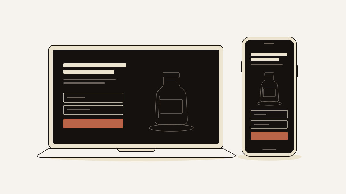
A black website suits visually led offers when the dark background makes your product, headline and enquiry button stand out. Choose a lighter design when warmth or lengthy reading matters more. Text must stay readable and form fields visible, however much atmosphere the dark background adds.
When a dark background helps visitors understand your offer
Dark backgrounds help when lighter text and images make it easier to understand what you offer.
For fashion, beauty and technology offers, black can suggest luxury or a modern feel. A product photograph against black can look as though it is under a spotlight. The space around it keeps attention on the item. If the product’s appearance helps explain its value, use this approach. Place proof that supports the offer before the enquiry form.
A healthcare offer built around warmth has a different task. Visitors may need reassurance about the practitioner and what happens at an appointment. Lighter, neutral colours can help create that feeling more directly. If your brand is playful, a dark backdrop should keep its colourful character rather than dull it.
Charcoal or deep navy can give you a similar effect to pure black. If decoration stands out more than the enquiry button, tone down the decoration.
Rules for readable text and visible form controls
Set text contrast and font weight together so letters stand out without looking fuzzy. Form controls need the same attention as the headline.
- If light text looks fuzzy, adjust the background, contrast and font weight. This effect is called halation: light letters appear blurred against the dark surface. Charcoal grey or deep navy can replace pure black; then adjust the text colour and weight until the letters look clear. Keep the text bright enough to read as you reduce the fuzziness.
- If thin lettering disappears, use a heavier weight and clearer contrast. Supporting copy and field labels need this check as much as large headings. Visitors need to read the offer’s conditions as easily as its promise.
- If everything competes, reserve bright accents and space for actions. Reduce decorative colours, images and competing elements so the action is easy to find. A vibrant button with clear space around it is easier to locate than one surrounded by equally bright headings and graphics.
- If fields blend into the page, make labels and boundaries easy to see. Labels should stay visible when someone starts typing. An outline or a different surface colour separates each field from the background, so visitors can see what belongs where without guessing.
- If an error is easy to miss, place a readable message beside the affected field. The message should explain what needs correcting and give the visitor a clear next step. A colour change alone leaves them searching for what went wrong.
Three dark designs and what visitors notice first
Text, images or colour can each lead a dark design. Each example below puts a different one first. Use that choice to decide what visitors should notice first on your page.
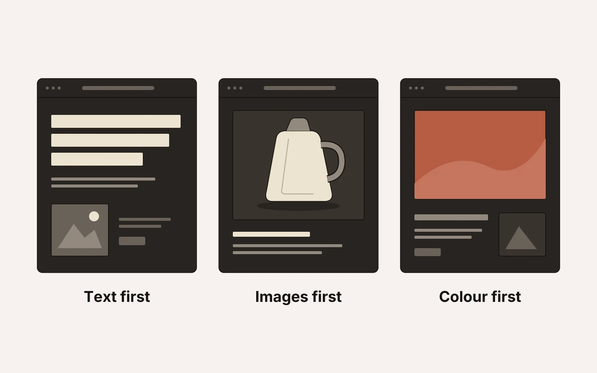
- Andrew Leguay uses black, white and dark orange, with black as the background. Using only these colours keeps them from competing for attention. If your offer needs one clear next step, mark it with the standout colour. That could mean using it on the enquiry button.
- Sam Phlix combines a black backdrop with large white lettering and images in one colour. The large letters help the words stand out alongside the images. If your headline explains something the photograph cannot, make it large enough to hold its place.
- A Day Out presents work in large, multicoloured blocks with uneven shapes against a dark background. Those blocks draw attention to the work. If examples of your work are the reason to enquire, put them first. Give visitors a clear route to the form afterwards.
Check your dark landing page before publishing
Before publishing, test the path from the first screen to a submitted enquiry on different devices. A desktop preview only shows part of it.
- Open the page on mobile and other devices, including an OLED screen. The offer and form labels should be readable without zooming. Check field boundaries and button placement too.
- If your logo disappears into the background, use a lighter version. Where brand colour details become hard to see, adjust their tint and intensity.
- Follow the links to see how the pages feel together. Moving from a black landing page to a bright white inventory page can feel disjointed, so check that transition and keep shared branding recognisable.
- Submit the form with required fields empty to check the error messages, then complete a valid submission. The confirmation should clearly tell you what happens next, and the enquiry should reach the inbox.
At landflow, we use exactly one conversion goal and one lead form per page. We stamp each lead’s source and campaign on the server when the form is submitted. Our pre-publish check verifies that the form writes to the inbox before any pixel fires.